Why AI Logos Look Generic — and How to Make Yours More Original
Most AI logos look generic because of shared templates, broad prompts, and safe design defaults. Learn how to write better logo briefs and create a more distinctive AI-generated logo.
Updated: May 2026 · 10 min read
Meta description: Most AI logos look generic because of shared templates, broad prompts, and safe design defaults. Learn how to write better logo briefs and create a more distinctive AI-generated logo.
Quick Answer
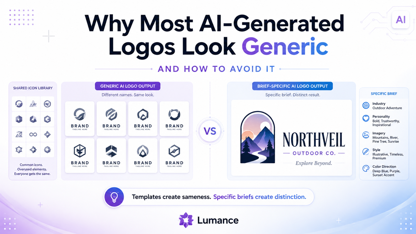
Most AI logo makers produce generic-looking results for one of two reasons: they assemble logos from shared template and icon libraries, or they generate from inputs that are too broad to produce a distinctive brand mark. In both cases, the result is often clean and professional — but not very ownable. The fix is not a better tool — it is a more specific brief.
Why Do AI Logos Look the Same?
AI logos often look the same because many tools rely on shared icon libraries, preset templates, questionnaire inputs, and safe design patterns. When many businesses choose the same industry, style, and color options, the tool produces similar results. To avoid generic output, use a prompt-based tool and write a specific brand brief that includes audience, personality, visual direction, and what to avoid.
The Misconception About AI Logo Generation
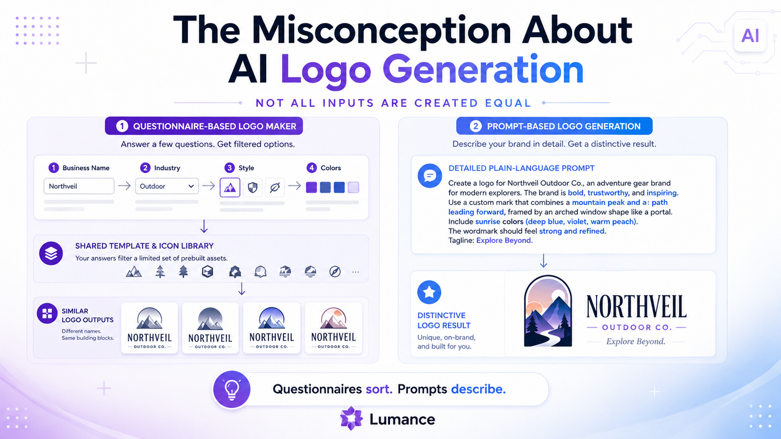
When most people hear "AI logo maker," they imagine something like: you describe your brand, the AI synthesizes a unique visual mark from that description, and you receive something original.
What many AI logo tools actually do is different. As Designlab's 2026 AI logo generator review found after hands-on testing: compared to newer generative tools, results from template-based platforms "can feel noticeably more templated and dated, with less originality and creative flexibility." One platform generated a logo that "looked nearly identical to what the platform generated two years ago."
That is still useful automation — it is not the same as brief-specific generative design. Template-first tools narrow and recombine existing options rather than creating a mark around a unique brand description. Understanding which type of tool you're using explains why the output looks the way it does.
Despite this, AI logo adoption is growing fast. According to Cropink's 2026 AI logo generator analysis, 40% of small businesses already use AI tools to create their logos. The challenge is not access — it is output quality.
When Generic Is Actually Fine
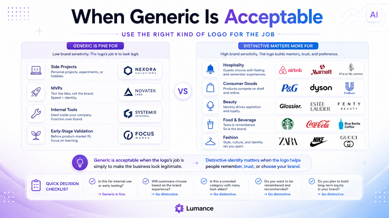
Before explaining how to avoid generic logos, it is worth being honest about when generic is acceptable.
Generic is fine when: the logo's only job is to make the business look legitimate. A side project, an MVP being validated, a business testing its idea — all of these need a professional-looking mark, not a distinctive one. A clean, competent, generic logo signals "real business" without requiring investment in differentiation.
Generic is a problem when: the logo needs to help the brand be remembered, trusted, or chosen in a crowded market. Consumer brands, hospitality businesses, ecommerce products, and any brand where visual identity is part of the value proposition — for all of these, a logo that could belong to any competitor is a real competitive disadvantage.
Know which situation you're in before optimizing for originality.
The Five Reasons AI Logos Look Generic
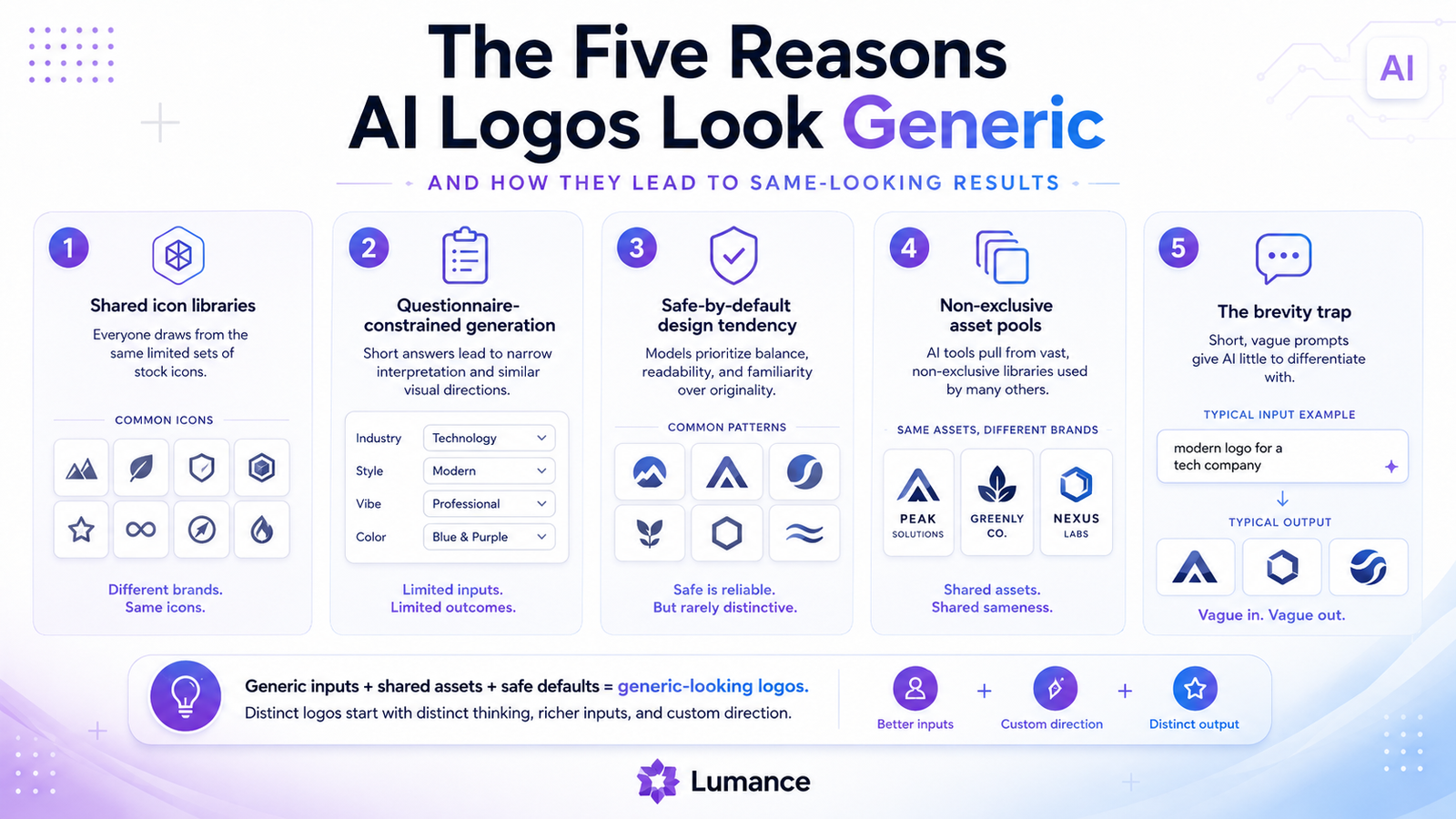
1. Shared Icon Libraries
The icons available in most logo maker platforms — the lightbulbs, the gears, the arrows, the abstract swooshes — are available to every user of that platform. Thousands of businesses have already used the same leaf for a wellness brand, the same diagonal stripe for a tech company, and the same abstract lettermark for a startup.
When your logo's icon is drawn from a shared library, it is structurally available to every other business that makes similar questionnaire choices. As Designlab's review notes, the most template-reliant platforms produce results that "feel noticeably more templated" — precisely because the underlying asset pool is shared.
2. Questionnaire-Constrained Generation
Most logo tools use a questionnaire: choose your industry, select preferred styles from visual examples, pick colors, indicate icon concepts. The AI narrows its output based on these answers.
The problem is that questionnaire options are finite. "Modern," "classic," "playful," "bold," "elegant" — these are broad categories that thousands of businesses in your industry also select. The AI receives nearly identical inputs for all of them and produces nearly identical outputs.
3. Safe-by-Default Design Tendency
AI systems trained on existing logos learn that certain combinations produce "good" logos — they appear frequently in successful brand identities and receive positive feedback during training. The AI defaults to these proven combinations.
The result is statistically safe design: combinations unlikely to look wrong because they match patterns that have worked before. "Unlikely to look wrong" is not the same as "distinctive." Safety produces professional-looking output — it does not produce ownable output.
4. Non-Exclusive Asset Pools
When a logo tool uses stock icons or fonts licensed from third-party providers, those same assets appear in other platforms, stock packs, and design tool plugins. The same abstract leaf icon in your logo maker may exist in a competitor's template library, an Envato stock pack, and a Figma plugin.
This is why structurally near-identical logos appear across different businesses in the same category — not because the AI made a mistake, but because the underlying asset pool is genuinely shared.
5. The Brevity Trap
Most AI logo tools give you a small input field and expect a short response. "Business name: [blank]. Industry: [dropdown]. Style: [select]."
This brevity lowers the barrier to getting started — but severely limits what the AI can do. "Coffee shop" generates nearly identical inputs from thousands of businesses. The AI cannot differentiate between them using so little information.
Generic AI Logo Checklist
Your AI logo may be too generic if:
- It uses a common icon — leaf, globe, gear, lightbulb, arrow, shield, or abstract swoosh
- It could belong to any business in your category without changing the name
- It only feels different from competitors because of color
- It uses a layout recognizable from another logo maker platform
- The icon and wordmark feel disconnected rather than designed together
- It looks polished but carries no specific brand idea
- It resembles the first page of Google Image results for your industry
- You cannot explain why this mark belongs specifically to your brand
If three or more apply, the logo has a specificity problem, not an execution problem.
What Prompt-Based Generation Does Differently
Prompt-based AI logo tools accept a free-form description of the brand and generate around that specific brief. The practical difference is significant — but it is not a guarantee of originality.
A vague prompt will still produce generic results. "Modern tech startup" from a prompt-based tool is not meaningfully different from "modern tech startup" selected through a questionnaire — both give the AI similarly limited information.
The advantage of prompt-based generation is that a specific, detailed prompt gives the model significantly more brand context to work with than a fixed questionnaire allows. A brief that describes audience, tone, visual direction, and what to avoid narrows the output space from "anything appropriate for tech" to something closer to "this specific brand's visual identity."
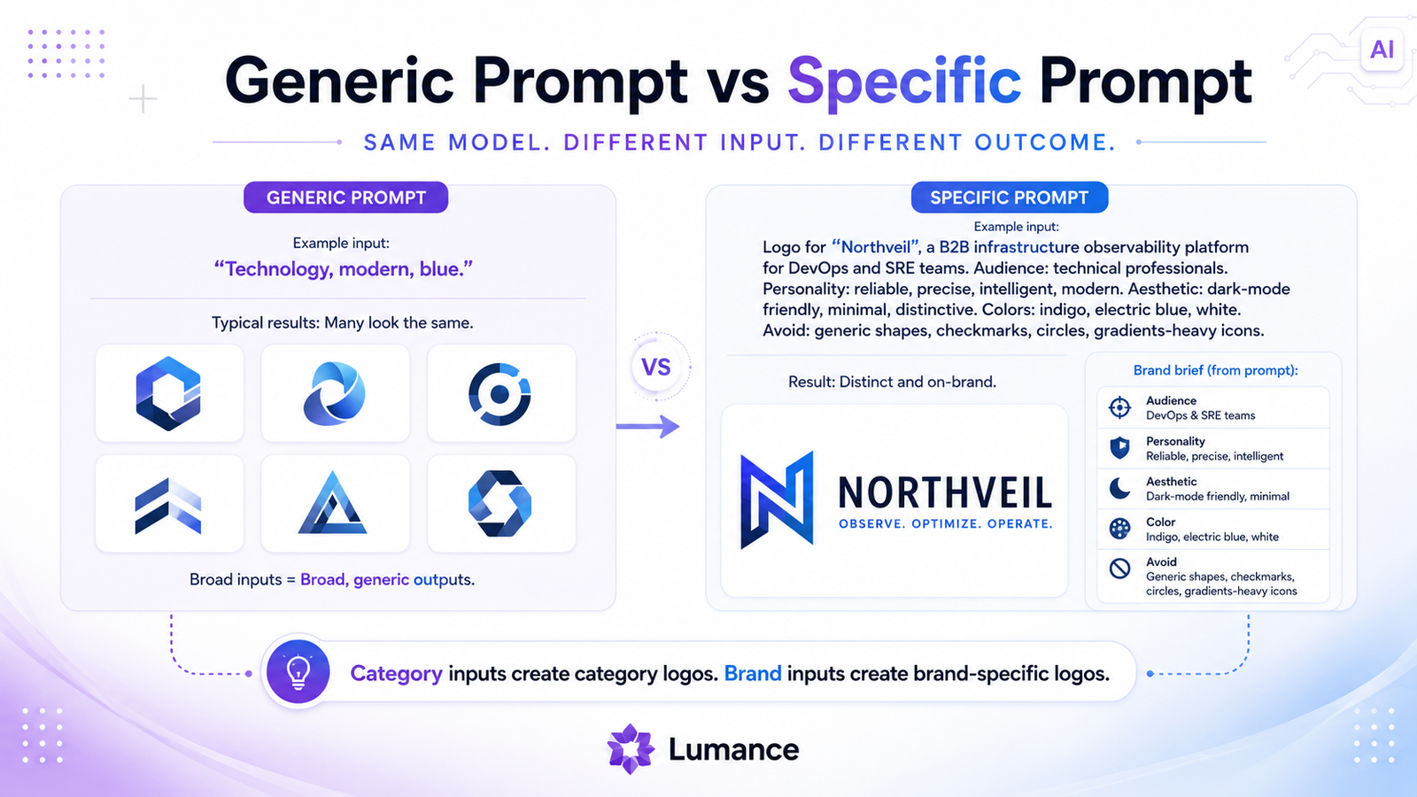
Generic input:
"Industry: Technology. Style: Modern. Color: Blue."
Specific input:
"A B2B infrastructure tool for developer teams. Brand feels like the intersection of precision engineering and creative problem-solving. Dark mode aesthetic. Think Linear meets Stripe. No literal tech icons — abstract geometric mark or strong wordmark only."
The first describes a category. The second describes a brand. The AI generates around the information it has — specificity produces specificity.
Better AI Logo Prompt Examples by Industry
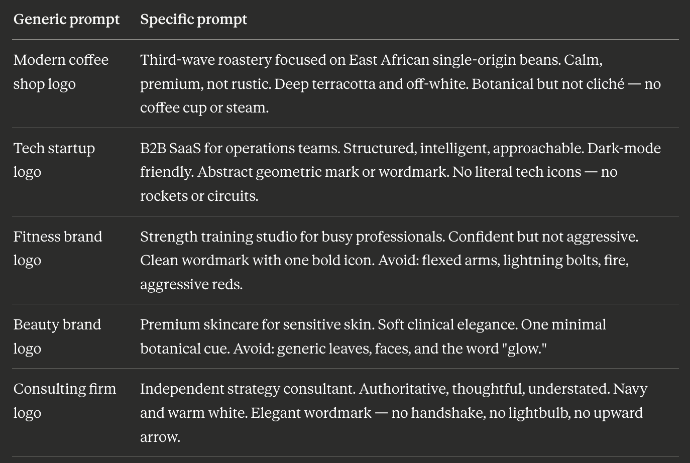
The right column takes more than 30 seconds to write. It produces output the left column cannot.
How to Avoid a Generic AI Logo: 7 Steps
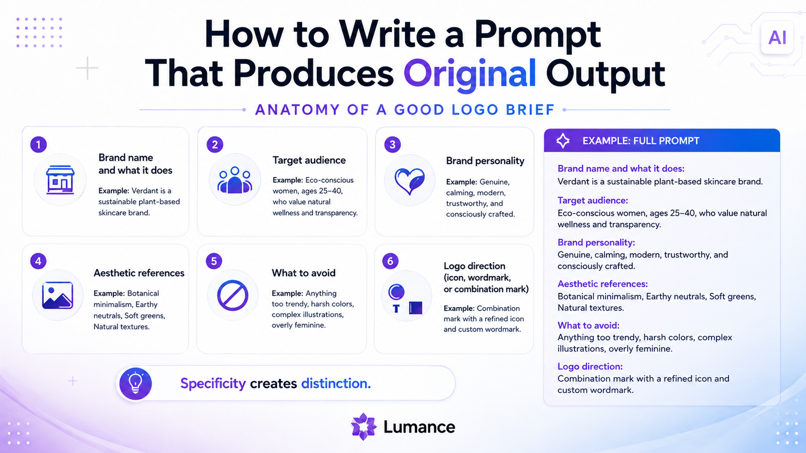
1. Start with the brand, not the industry. Describe what makes your brand different within its category — not what category it belongs to. "Coffee shop" is a category. "East African single-origin roastery focused on the farmer's story" is a brand.
2. Describe your audience specifically. Who is this logo for? "Busy professionals in urban environments who treat coffee as a considered ritual, not a commodity" is more useful than "coffee drinkers."
3. Name a visual direction, not just a style word. "Minimal" and "modern" describe half the logos on the internet. "Like a well-edited independent bookshop — warm restraint, considered typography, nothing decorative" gives the AI something specific.
4. Say what to avoid. Negative constraints are often more useful than positive ones. "No coffee cup icons, no steam, no globe" immediately eliminates the most common options and pushes the AI toward differentiated territory.
5. Specify logo structure. Icon + wordmark? Wordmark only? Monogram? Each produces fundamentally different output. Don't leave this unspecified.
6. Refine the prompt, not just the output. If the first generation is generic, the problem is usually in the brief. Describe what was wrong with it — "too literal," "too corporate," "icon and wordmark feel disconnected" — and revise the prompt rather than just regenerating the same brief.
7. Test against competitors. Before finalizing, search Google Images for logos in your specific industry. Does your mark look like it belongs in those results — or like it belongs to one specific brand? That test reveals more than any other.
How Do You Make an AI Logo Less Generic?
To make an AI logo less generic, write a specific prompt that describes the brand's audience, personality, visual direction, competitors to avoid, color preferences, and preferred logo structure. Avoid broad inputs like "modern tech logo" or "coffee shop logo." After generating, compare the result against competitor logos and refine the prompt until the mark has one specific idea that belongs to your brand.
When Generic Is Acceptable (Revisited)
It is worth reiterating: generic is not always the enemy. As ManyPixels' 2026 logo design trends report notes, "the best logo design ideas come from choosing one strong direction and applying it consistently" — not necessarily from radical originality. A clean, simple, somewhat generic mark used consistently over time builds more recognition than a distinctive mark used inconsistently.
The choice between generic and specific is a strategic one, not a technical one. Make it intentionally.
FAQ
Are all AI logos generic?
No. The genericity of AI logo output correlates directly with the specificity of the input. Template-based tools with shared icon libraries produce generic output by default. Prompt-based tools with specific, detailed briefs can produce significantly more distinctive output. The tool matters, but the brief matters more.
Can I make a template-based logo less generic?
To some extent. Customizing colors away from defaults, choosing less common fonts, and editing icon placement all help. But the fundamental structure — the icon shape, the template layout — is still drawn from a shared pool. Customization reduces genericness at the surface; it doesn't change the underlying shared foundation.
Is an AI logo ever appropriate for trademarking?
Trademark eligibility depends on distinctiveness and likelihood of confusion with existing marks — not on how the logo was created. A logo assembled from shared stock icons may be harder to protect because those elements are not exclusive to any one brand. Trademark law is jurisdiction-dependent and nuanced; always consult a trademark attorney before filing regardless of which tool you used.
How do I know if my AI logo is too generic?
Run the Google Image Search test: search for logos in your specific industry. If your logo looks like it could belong to any of the first ten results, it is generic. If it has a clearly distinct visual character — a different approach, an unusual mark, something that reads as specific to your brand — it has differentiated itself.
Generate a Logo From a Real Brand Brief
Lumance generates logos from a plain-language brand brief, not a generic template selection. Describe your audience, tone, visual direction, colors, and what to avoid — then generate logo concepts built around that specific context.
Before you generate, try this format:
"Create a logo for [brand name], a [specific business description] for [target audience]. The brand feels [3 adjectives]. Visual direction: [reference or style — e.g., 'like X meets Y']. Avoid [specific icons or styles]. Prefer [icon / wordmark / combination mark]."
The more specific the brief, the more specific the output.