What Makes a Logo Professional? 5 Qualities, Examples, and Quick Tests
A professional logo is simple, scalable, appropriate for the brand, distinctive from competitors, and consistent across formats.
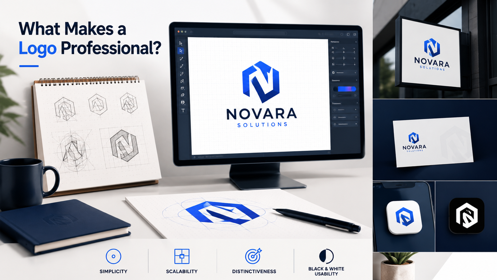
Updated: May 2026 · 8 min read
A professional logo is simple, scalable, distinctive, and usable everywhere. Learn the five tests that separate polished logos from amateur designs.
Quick Answer
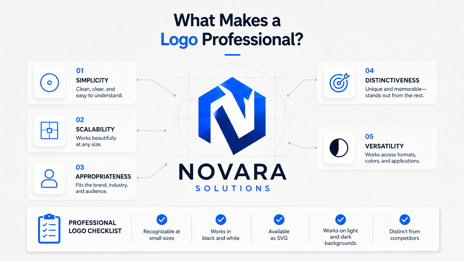
A professional logo is simple, scalable, appropriate for the brand, distinctive from competitors, and consistent across formats. It should work at small sizes, in black and white, on light and dark backgrounds, and as a vector file (SVG). Cost, complexity, and visual style do not determine professionalism — these five qualities do.
What Is a Professional Logo?
A professional logo is a brand mark that remains clear, recognizable, and appropriate across real-world use cases — including websites, social profiles, packaging, print materials, and app icons. It does not fail when reduced to a favicon, does not lose its identity in monochrome, and does not require a specific background color to be legible.
Professionalism in a logo is not a visual style. It is a set of functional criteria the mark either meets or does not meet.
The Five Qualities of a Professional Logo
1. Simplicity
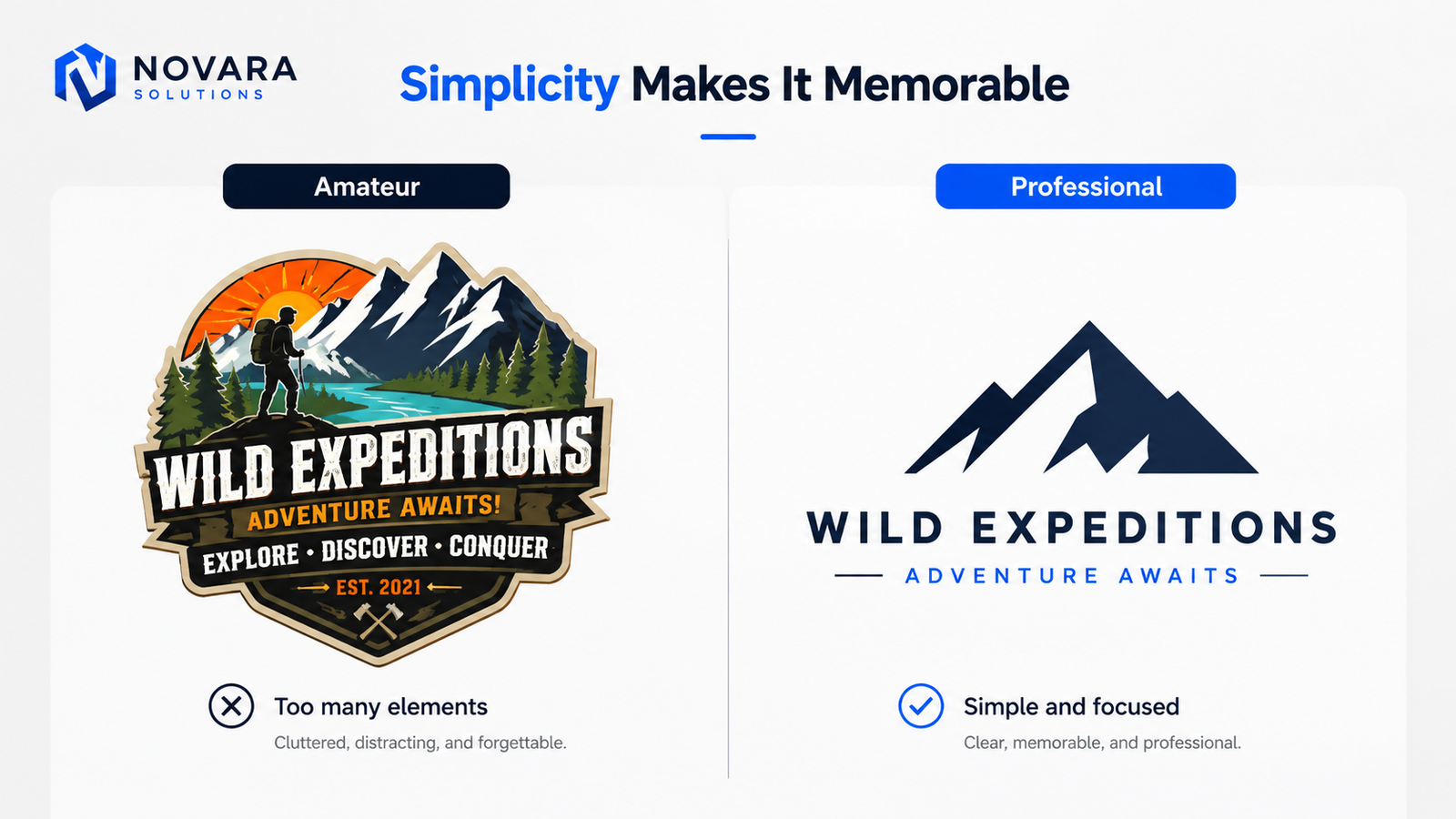
The most reliable indicator of a professional logo is restraint — the absence of unnecessary elements. Professional logos use the fewest elements necessary to communicate the brand: one or two colors, one typeface, a single icon concept if used at all.
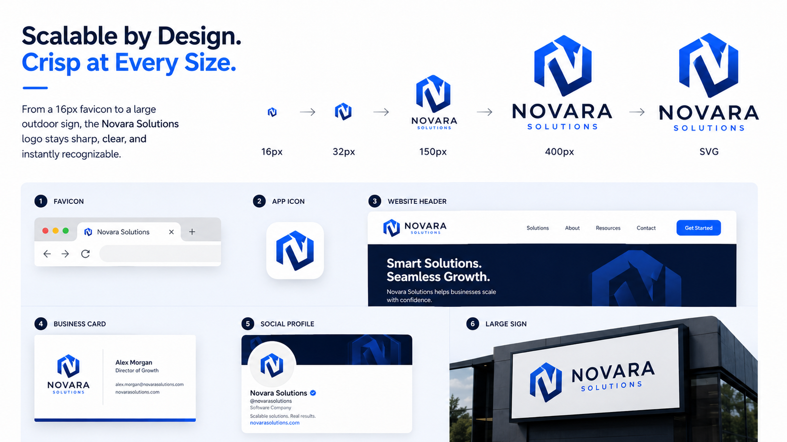
This is not aesthetic preference. It is functional necessity. Logos live at many sizes simultaneously — a 16px browser favicon, a 400px social profile, a two-meter building sign. Complex marks with fine details, overlapping elements, or decorative frames fall apart at small sizes. Simple marks scale cleanly across all of them.
What this looks like in practice:
Compare Mailchimp's chimp mark — a single, stylized chimpanzee face — with a small business logo featuring a globe, a handshake, two fonts, and four colors. Both are "logos." Only one works at favicon size, on a t-shirt, in an email signature, and as an embossed stamp.
The brands most people recognize instantly — Penguin Books, Patagonia, Spotify — use marks simple enough to reproduce from memory. That simplicity is deliberate.
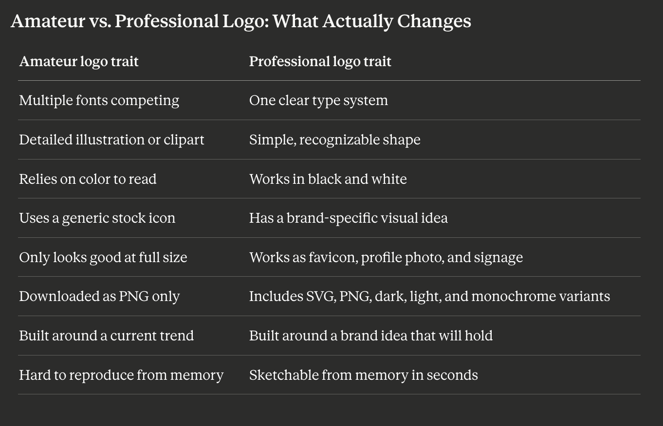
What amateurs do: Add elements to fill space. Use three fonts, four colors, a detailed illustration, and a tagline compressed into a small container.
What professionals do: Remove everything that isn't necessary. Then remove more.
2. Scalability
A professional logo works at every size it will ever be used — from the browser favicon (16px) to a banner at a trade show (several meters wide).
The test is concrete: display your logo at 32×32 pixels. Is the brand mark still recognizable? Is the wordmark still legible, or does it collapse into a blur? If you can't read it and can't recognize the icon, the logo does not scale.
Scalability is also why vector formats (SVG) are the professional standard. SVG files are defined by mathematical paths, not pixel grids. They render crisply at any output size. PNG and JPG files are fixed-resolution grids — adequate on screen at native size, problematic when scaled up for print or signage.
Scalability test: View your logo at 32px (favicon), 150px (email signature), and 400px (social profile). All three should look intentional.
3. Appropriateness
A professional logo signals the right brand category immediately — and then differentiates within it.
A children's toy brand should feel playful. A law firm should feel authoritative. A luxury brand should feel refined. Getting this wrong — a law firm using a bubbly rounded font and bright orange — reads as amateurish even if the technical execution is correct. The viewer's intuition about the category is violated.
Appropriateness does not mean conformity. Innocent smoothies uses a hand-drawn smiley face on fruit — unconventional for food and beverage, but perfectly appropriate to the brand's personality. The mark signals health and friendliness through appropriate visual language, then differentiates with its personality.
The question is not "does this look cool?" It is "does someone seeing this for the first time understand what kind of brand this is?"
4. Distinctiveness
A professional logo is recognizable as belonging to one specific brand. It is not recognizable as a template, a stock icon, or a generic symbol that hundreds of other businesses could equally claim.
This is where many AI-generated and template-based logos fail. When a logo uses an icon from a shared library available to thousands of users, or assembles elements that any user of the same platform could combine similarly, the output is structurally indistinct. Professional designers can often identify the platform a logo was made with at a glance.
Distinctiveness comes from specificity: a brief-specific icon concept, an unexpected color pairing, a proportional relationship between elements that belongs to this brand specifically. Patagonia's mountain mark. Lacoste's crocodile. Dropbox's open box. Each mark is simple — and each is impossible to confuse with any other brand.
5. Versatility and Consistency
A professional logo works in all the contexts it will be applied — not just the comfortable default of full color on white.
Contexts a logo must serve:
- Full color on white background
- Full color on dark background
- Single color black
- Single color white (reversed)
- Embroidery (typically one or two thread colors)
- Greyscale photocopy
- Browser favicon
- Watermark
A logo that only survives its best-case context is not professionally complete.
Timelessness is part of versatility. A logo that only works because a specific design trend is currently popular — neon gradients, maximalist retro badges, vaporwave aesthetics — will begin to read as dated when that trend passes. Professional logos are built around strong shapes, balanced typography, and a clear brand idea rather than trend-specific stylistic choices. The question to ask of any stylistic decision: "Will this still feel intentional in 10 years?"
Consistency compounds this quality: the same mark, used reliably across every touchpoint over time, builds the brand recognition that makes a logo valuable.
Professional Logo Checklist
Use these tests before finalizing any logo:
- Recognizable at 32×32px (favicon size)?
- Works in black and white without losing identity?
- Legible without gradients or effects?
- Typography readable at small sizes?
- Signals the right brand category immediately?
- Different from direct competitors in the same space?
- Available as SVG (vector) file?
- Works on both light and dark backgrounds?
- Avoids generic stock icon clichés (lightbulbs, globes, gears, arrows)?
- Still looks intentional when imagined 10 years from now?
A logo that passes all ten tests is professionally complete. A logo that fails any of them has a solvable problem.
What Does NOT Make a Logo Professional
Complexity. More icons, more colors, more typefaces do not add professionalism. The evidence runs the other direction — the most recognized logos in the world are almost uniformly simple.
Gradients by default. Gradients can work intentionally, but they age quickly, fail in single-color applications, and print inconsistently. A gradient applied because "it looks modern" rather than because it communicates something specific is a design liability.
Decorative fonts. Script and hand-lettered fonts look striking at large sizes and become unreadable at small sizes. Their strong aesthetic associations also date faster than neutral, well-designed typefaces.
Category clichés. The lightbulb for ideas. The gear for engineering. The speech bubble for communication. These are so overused that they communicate industry rather than brand — the viewer registers "this is a tech company," not "this is your company."
Matching the competitor. If every business in your category uses dark navy and white, matching that palette signals undifferentiated participation. Appropriateness and distinctiveness must coexist.
The Three Tests Every Logo Should Pass
The Squint Test: Display your logo at normal size. Squint until it blurs. A clear, confident shape should remain. If it dissolves into visual noise, the mark is too complex.
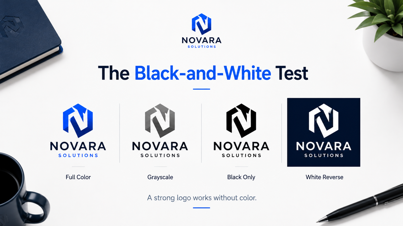
The Black-and-White Test: Convert to grayscale. If the logo loses all visual impact without color, the structure is relying on color to do work the mark itself should be doing. Strong logos are designed in black and white first.
The Favicon Test: Resize to 32×32 pixels. Is the brand recognizable? Can the mark — or a simplified companion mark — function at this size? If not, the logo will fail at real-world digital touchpoints.
FAQ
How much does a professional logo cost?
Professional quality is not determined by cost. A well-briefed AI-generated logo can be more professional than a poorly executed $5,000 designer logo. Cost buys time, craft attention, and iteration — it does not guarantee the five qualities above.
Can an AI-generated logo be professional?
Yes — when it is generated from a specific brief, refined to meet the five criteria, and downloaded in the correct vector (SVG) format. Generic prompts produce generic results. Specific briefs — describing brand personality, aesthetic direction, and what to avoid — produce distinctive output.
What is the minimum complete logo package?
SVG (master vector), transparent PNG, dark-background PNG, light-background PNG, and ideally a black-only and white-only variant. Any logo delivery that does not include SVG is professionally incomplete.
Should my logo include a tagline?
Usually not embedded in the mark. Taglines in logos cause legibility problems at small sizes and date quickly. A tagline can be a separate text element added or removed depending on context, rather than permanently locked into the logo file.
How do I know if my logo looks generic?
Do a Google Image Search for logos in your industry. If your logo could belong to any of the first ten results — if there is nothing about it that says "this could only be us" — it is generic.
Create a Logo That Passes These Tests
Lumance generates logo concepts from a plain-language brand brief, then exports your final mark as SVG for professional use. Before downloading, test your logo in black and white, at small sizes, and on light and dark backgrounds — everything the checklist above covers.