What Makes a Logo Memorable? 5 Design Traits and 4 Recall Tests
Learn what makes a logo memorable, from simplicity and distinctiveness to color specificity and repetition — plus four practical tests for logo recall.
Updated: May 2026 · 9 min read
Meta description: Learn what makes a logo memorable, from simplicity and distinctiveness to color specificity and repetition — plus four practical tests for logo recall.
Quick Answer
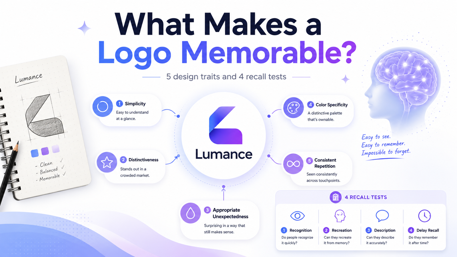
A memorable logo is simple, distinctive, appropriate, and consistently used. It usually has one dominant visual idea — a shape, letterform, symbol, or color cue — that people can describe or sketch after seeing it briefly. Beauty can help, but recall matters more: a logo succeeds when people remember it later, not when it impresses at first glance.
What Makes a Logo Memorable?
A memorable logo is simple enough to recognize quickly, distinctive enough to avoid confusion with competitors, appropriate enough to signal the right brand category, and consistent enough to become familiar over time. The strongest logos usually have one dominant visual idea that people can describe or sketch after brief exposure.
Why Memorability Matters More Than Beauty
A beautiful logo that cannot be remembered has failed at its primary job. A logo is not a piece of art — it is a recall device. Its purpose is to be seen, stored in memory, and retrieved at the moment of a purchasing decision.
This reframes how logos should be evaluated. The question is not "does this look impressive?" It is "can someone who saw this once describe it accurately a week later?"
A logo that answers yes to the second question — even if it wouldn't win a design award — is doing its job. A visually stunning logo that evaporates from memory immediately is not.

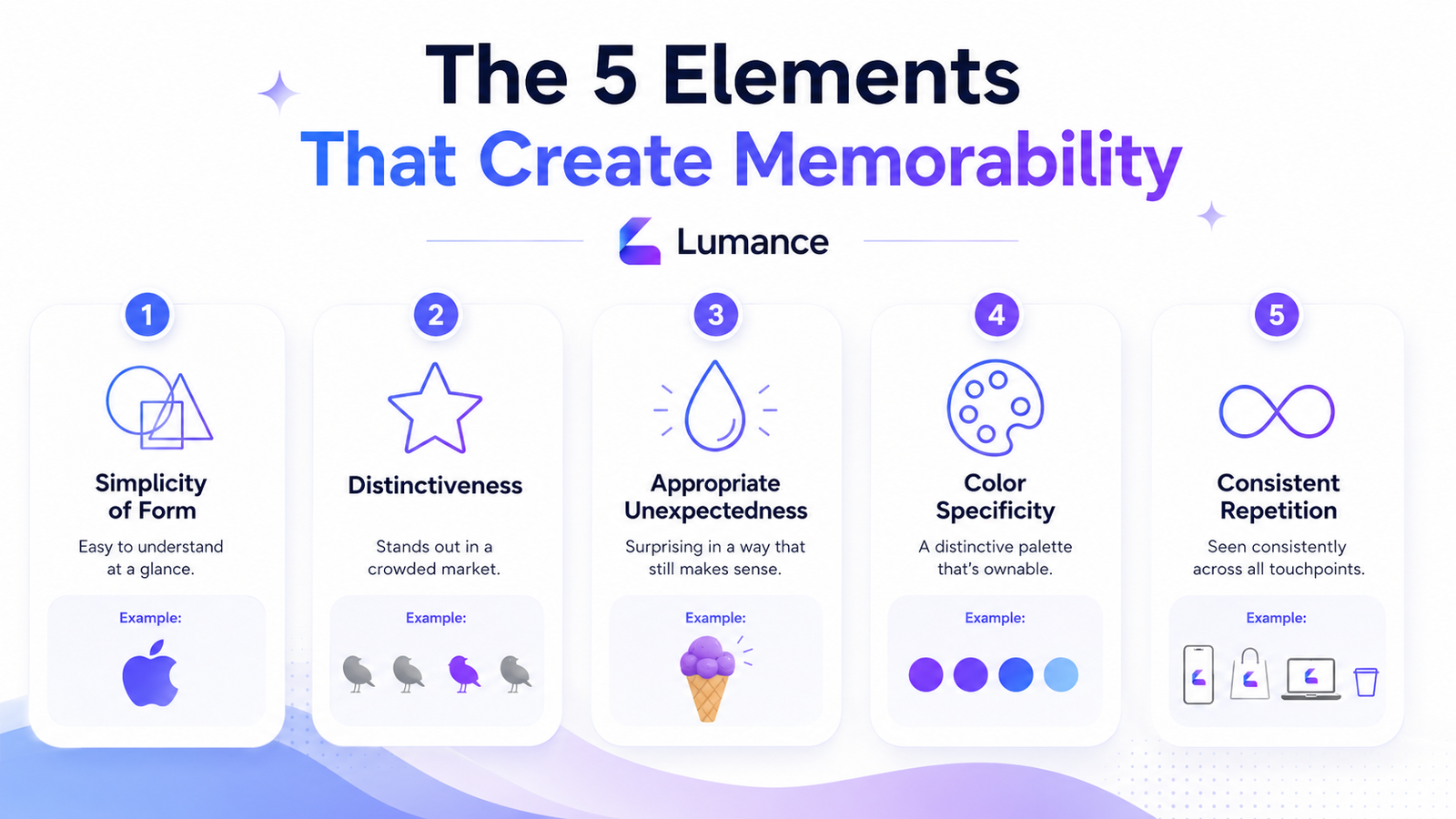
The 5 Elements That Create Memorability
1. Simplicity of Form
The brain stores simple visual forms more efficiently than complex ones. A single bold shape — a circle, a diagonal mark, a clear letterform — is encoded as a compact mental unit. A detailed illustration with multiple interlocking elements requires significantly more cognitive work to encode and retrieve.
When people are asked to sketch a logo from memory, they almost always draw the essence — the basic shape — not the details. What they can reproduce is what they actually retained. If the core of your logo can be sketched in five seconds, it has a strong memory footprint.
A small business example: A bakery logo is not memorable because it uses a wheat stalk — hundreds of bakeries do. It becomes memorable when the wheat shape is integrated into the first letter of the brand name, or when the mark uses one distinct silhouette that customers can draw after seeing it once. The icon is not the differentiator. The specific, integrated treatment of a familiar idea is.
2. Distinctiveness
A logo can be simple and still be generic. A circle with a letter in it is simple — but it is not distinctive because hundreds of brands use the same construction. Distinctiveness is specificity: a mark that, by its shape or treatment, could belong to only one brand.
The FedEx wordmark uses a specific typeface with a specific modification so that the negative space between two letters forms an arrow. Once seen, it cannot be unseen — and it can never be confused with another brand. The mark is simple and distinctive simultaneously.
For a founder context: a consulting firm that uses an abstract geometric lettermark in navy and gold is not yet distinctive — it describes a template, not a brand. The same lettermark with a specific proportional treatment, an unusual weight, or an integration between letters is moving toward distinctiveness.
3. Appropriate Unexpectedness
This is the most underrated element of memorable logo design. Most design advice says "be unique" without explaining how to be unique without being confusing. The tension is real: a logo that is too expected blends into the category; a logo that is too unexpected signals the wrong category entirely.
Memorable logos sit at the intersection. They are appropriate enough to immediately signal the right category — and then they have one element that is surprising enough to stick.
A coffee brand that uses an organic, botanical illustration of a coffee plant is appropriate. If that illustration is rendered as a minimal, single-line drawing in an unexpected color — say, a deep charcoal with a single warm amber accent — the unexpectedness makes it memorable within the appropriate frame.
The question to ask: "Does this make sense for our category, and is there one thing here that people won't have seen exactly like this before?"
4. Color Specificity
One committed brand color is more memorable than many. This is not because color quantity affects memory directly — it is because commitment to one or two colors creates a consistent signal that compounds with exposure over time.
For early-stage brands, the goal is not to immediately "own" a color in your market. That level of color recognition requires years of consistent exposure (and often significant marketing spend). The goal for a new brand is to use color consistently enough that customers start associating it with you as they encounter it repeatedly.
Choose one or two colors deliberately. Use them consistently. Avoid changing them between contexts or using variations that dilute the signal.
5. Consistent Repetition
The most technically well-designed logo in the world will not be memorable if it is seen infrequently. Memorability is built through exposure across time and contexts: website, social media, packaging, email signatures, signage, documents.
Inconsistency destroys this effect. If the logo color varies between applications — darker on social, lighter on print, completely different on presentations — the memory trace never solidifies. Every inconsistency is a missed opportunity to reinforce the same signal.
Brand guidelines exist not because designers enjoy rules, but because consistency is the mechanism through which recognition is built.
Memorable Logo Checklist
A logo is more likely to be remembered if:
- It can be sketched from memory in a few seconds
- It has one dominant shape or visual idea
- It does not look like a generic category icon (lightbulb, gear, globe, speech bubble)
- It feels appropriate for the brand category
- It includes one unexpected but relevant detail
- It uses one or two consistent brand colors
- It works without color
- It appears consistently across every brand touchpoint
- It looks clearly different from direct competitors in the same space
Logo Memorability Scorecard
Score your logo from 0–2 on each factor:
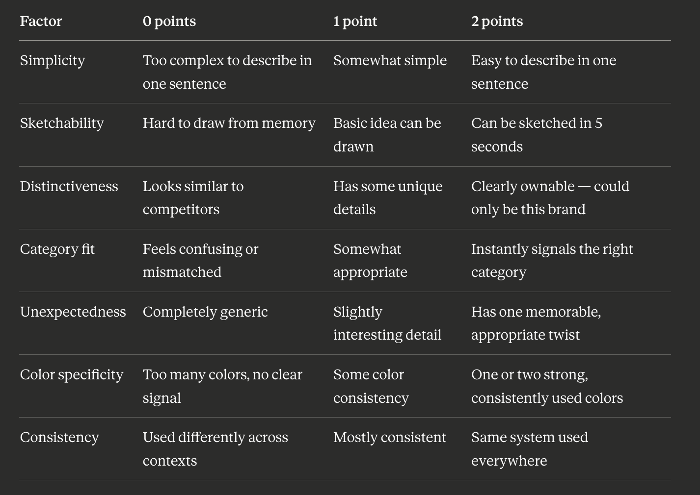
11–14: Strong memory potential — this logo can build recognition
7–10: Memorable in some contexts but needs refinement
Below 7: Too generic or complex — difficult to build recall with this mark
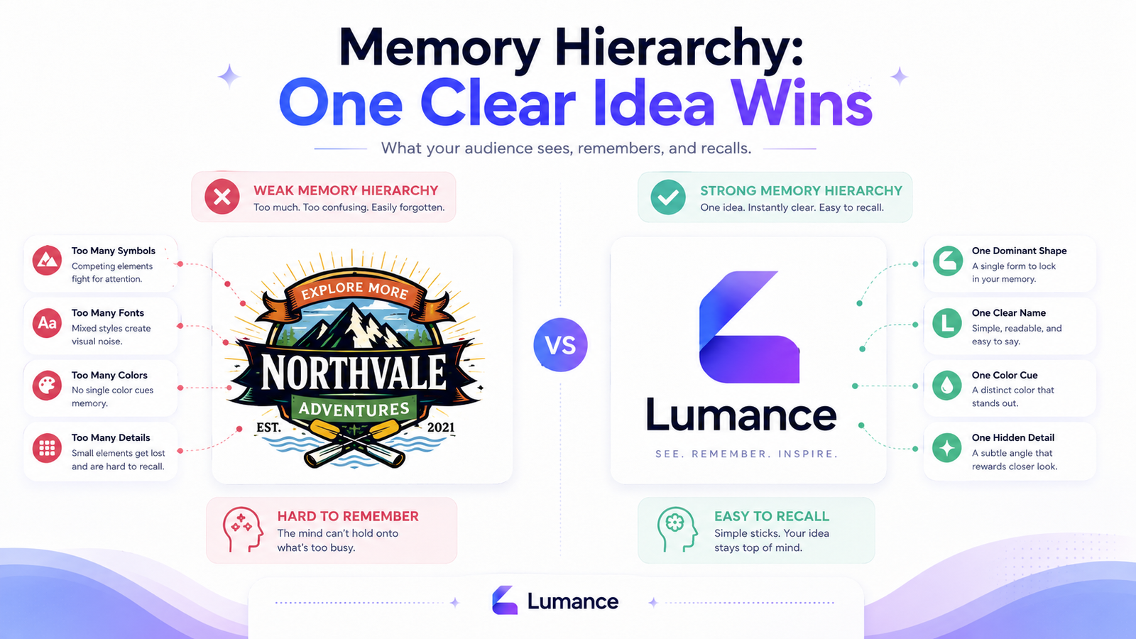
Build a Memory Hierarchy
Memorable logos have one dominant thing people remember first.
Weak memory hierarchy:
- Three symbols competing for attention
- Two fonts in the wordmark
- Five colors across the mark
- A tagline integrated into the logo
- A decorative frame around everything
Strong memory hierarchy:
- One main shape or icon
- One clear brand name
- One color cue
- One optional hidden or unexpected detail
The viewer does not need to remember everything. They only need to remember the right thing. If someone can say "it's the one with the green leaf" or "the diagonal mark in dark blue," the logo is working. If they say "I think it had some shapes and some text in a few colors?" — it is not.
Every element added to a logo is another thing the memory must store. Elements that don't contribute to the dominant idea compete against it. Remove them.
How to Run a Logo Recall Test
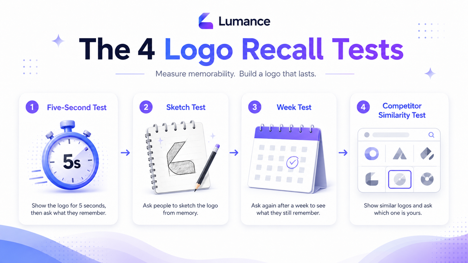
The Five-Second Test
Show your logo to 5–10 people for five seconds. Hide it. Ask three questions:
- What shape or symbol do you remember?
- What type of brand do you think this is?
- Can you sketch the main idea?
Pass: Most people describe the same core element and sketch a recognizable approximation.
Fail: Everyone describes a different detail — or only remembers the color. The logo has no single dominant idea strong enough to anchor memory.
The Sketch Test
Ask someone who has seen the logo — for any length of time — to draw it from memory without seeing it again.
What they draw is what they retained. If the sketch captures the essence of the mark, the logo has strong recall. If the sketch is unrelated to the actual mark, the memory trace failed to form.
The Week Test
Show your logo to someone. Do not mention it again. Ask about it one week later: "Can you describe the logo you saw last week?"
If they can describe the dominant idea — the shape, the general color, the basic concept — the logo made a lasting impression. If they have no memory of it, the logo did not create a sufficient memory trace on first exposure.
The Competitor Similarity Test
Search Google Images for logos in your industry. Does your logo look like it could belong to any of the first ten results? If it could, it is not yet distinctive enough to build its own recall separate from the category signal.
This is not about being different for its own sake — it is about ensuring the brand has its own visual identity rather than blending into the category average.
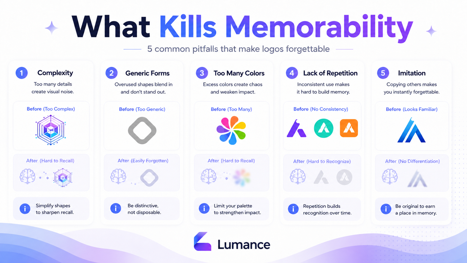
What Kills Memorability
Complexity. Every additional element divides the cognitive resources available for encoding. More elements mean a weaker trace for each one.
Generic forms. The lightbulb for ideas. The speech bubble for communication. The globe for global reach. These are so overused that the brain files them as category signals rather than brand signals. The viewer thinks "tech company" — not your company.
Too many colors. As above — one or two colors create a specific signal. Five colors create visual noise with no single color becoming memorable.
Lack of repetition. Memory is built through exposure. A logo seen once rarely sticks. A logo seen consistently across many touchpoints over time builds recognition that compounds.
Imitation. A logo that closely resembles a more recognized brand in the same category triggers the wrong recognition. The viewer thinks of the original, not the imitator.
On Famous Examples: A Practical Note
Most writing about memorable logos leans on the same examples: Nike, Apple, FedEx, Amazon. These are useful because they are universally known — but they are also universally known because of decades of exposure at enormous scale.
The lesson from these marks is not "be Nike." It is: simple marks, consistently applied over long periods, build the strongest recall. That principle applies at any scale — to a ten-person startup as much as to a global brand.
A simpler design principle does not produce a simpler brand. Patagonia's mountain mark. Innocent's smiley face logo. Spotify's sound-wave circle. All are simple, all are specific to their brand, and all were built by smaller companies before they became recognizable.
A brief note on case studies: it is tempting to compare IBM's simple striped lettermark with the more complex NeXT cube logo and conclude that simpler always wins. The comparison is not perfectly fair — IBM had decades more exposure and market presence than NeXT. But it still illustrates a design truth: simpler marks create a lower-friction path from exposure to memory, all else being equal.
FAQ
Do bigger brands have more memorable logos because of marketing spend?
Marketing spend increases exposure, which builds memory through repetition. But simple marks benefit more from repetition than complex ones — they encode more efficiently each time they are seen. Budget amplifies a strong mark; it cannot fully compensate for a weak or generic one.
Should a logo tell a story to be memorable?
Stories embedded in logos — the FedEx arrow, the Amazon smile — add an additional memorability layer when discovered. But the logo must work without the story. The hidden detail rewards attention; it does not replace the mark's core function.
Is it better to have a wordmark or an icon?
Both can be memorable. Wordmarks work when the brand name is short, visually interesting, and distinct. Icon marks work when the symbol can carry the brand without text. Early-stage brands typically benefit from a lockup (icon + wordmark) that can eventually separate as recognition grows.
How long does it take for a logo to become memorable?
There is no fixed number — it depends on exposure frequency, the simplicity of the mark, and the consistency of use. A simple mark used consistently across multiple touchpoints builds recognition faster than a complex mark used inconsistently in a single channel.
Create a Logo People Can Actually Remember
Lumance generates logo concepts from a specific brand brief — your brand's tone, audience, and visual direction — rather than from a generic template library. After generating a concept, run the five-second test, the sketch test, and the competitor similarity check before finalizing the mark.