The Black-and-White Logo Test: How to Check If Your Logo Is Strong
Learn how to test whether your logo works in black and white, why color should enhance — not carry — a logo, and which monochrome logo files every brand needs.
Updated: May 2026 · 8 min read
Meta description: Learn how to test whether your logo works in black and white, why color should enhance — not carry — a logo, and which monochrome logo files every brand needs.
Quick Answer
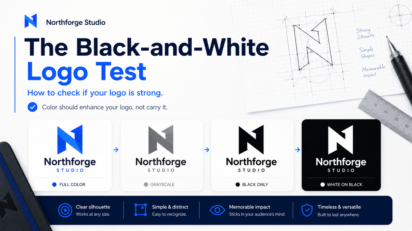
A logo should work in black and white because color should enhance the mark, not carry it. If a logo loses its identity, legibility, or visual impact when converted to grayscale, pure black, or white-on-black, the design has a structural problem. The strongest logos remain recognizable through shape, proportion, contrast, and typography alone — color makes them stronger, but removing it doesn't break them.
What Is the Black-and-White Logo Test?
The black-and-white logo test checks whether a logo remains recognizable, legible, and visually balanced when all color is removed. A logo passes if its shape, contrast, and typography still work in grayscale, pure black, and reversed white-on-black. A logo fails if it depends on color differentiation to separate elements, maintain contrast, or preserve visual impact.
This is not an aesthetic preference — it is a structural quality test. It reveals whether the mark itself is doing the work, or whether color is compensating for a weak underlying structure.
Color as Enhancement, Not a Crutch
Color is processed before rational interpretation. A warm orange and a confident blue create strong emotional associations before anyone reads the brand name. This makes color feel essential to a logo — and it is powerful. But it should amplify structure, not replace it.
When color is removed, the mark has nowhere to hide. A distinctive icon shape remains distinctive. A well-spaced wordmark remains readable. A strong silhouette remains strong.
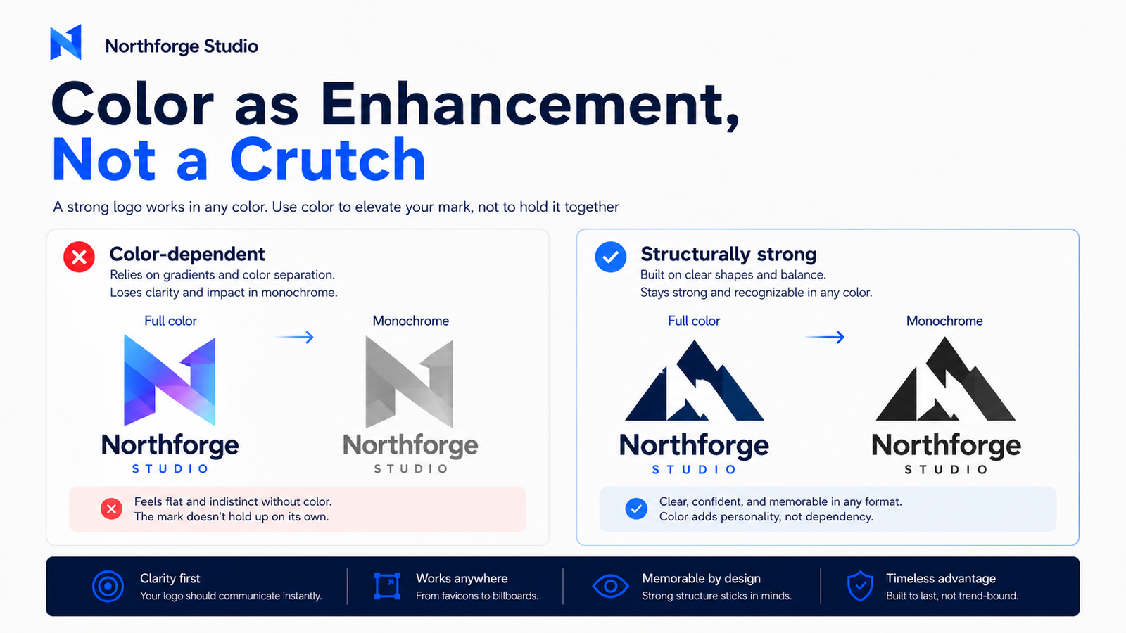
A logo that relied on color to differentiate its elements — a gradient separating shapes that would otherwise merge, a blue-on-orange contrast that disappears in grey — exposes its structural weakness in monochrome. The gradient becomes a flat blob. The contrast disappears.
The principle: Design the mark so it works without color. Then add color to make it better. Most amateur logos do the opposite — design with color first, then discover the structural problems too late.
The Real-World Contexts That Require Black and White
The black-and-white test is not theoretical. Your logo will appear in monochrome in several common professional contexts:
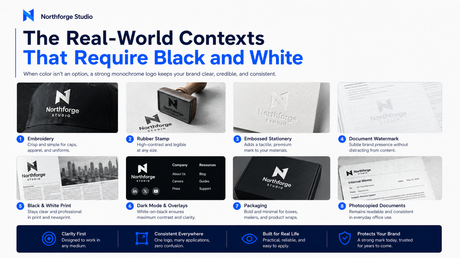
Embroidery and merchandise. Thread embroidery on uniforms, hats, and branded merchandise works best in one or two colors. Fine-detail, multi-color logos are either impractical or prohibitively expensive to embroider accurately. The single-color version of your logo is what goes on the merchandise.
Stamps, embossing, and stationery. Traditional letterhead, rubber stamps, wax seals, and embossed stationery are monochrome by design.
Watermarks and dark-background overlays. Watermarks are almost always single-color. A logo overlaid on a dark background in a video intro, a packaging design, or a digital banner needs to work as a clean white mark without color support.
Printed trade and local media. Black-and-white print advertising is common in trade publications, local newspapers, and cost-sensitive print runs. Your logo will appear in these contexts without color at some point.
Internal documents and photocopying. Contracts, forms, internal reports, and photocopied materials render logos in grayscale automatically. A color-dependent logo becomes an ambiguous smudge.
Online dark mode. Dark-mode interfaces, dark footers, and black-background digital assets require a white-on-dark logo variant. Without one, the logo either disappears or is placed on an awkward white box.
Every context above is normal, frequent, and predictable. A logo package without a monochrome variant is not professionally complete.
How to Test Your Logo in Black and White
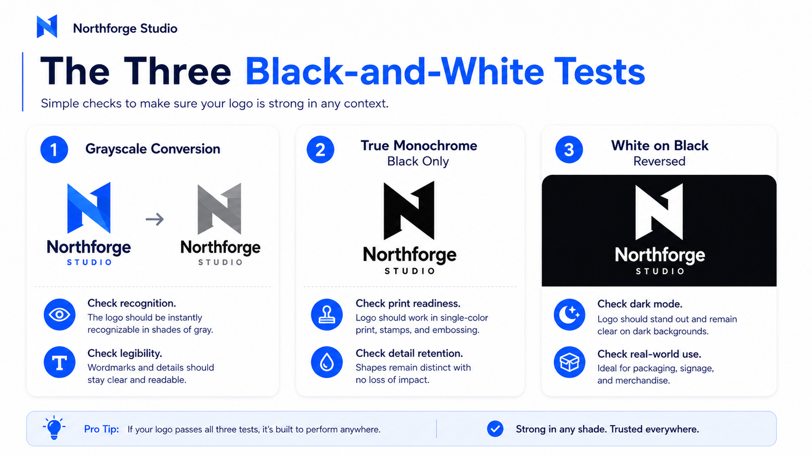
Three tests — run them in order:
Test 1: Grayscale Conversion
Open your logo in any image editing tool. Desaturate it completely (remove all color) but preserve the tonal differences. This is grayscale — you still have light and dark values, just no hue.
What to look for: Does the logo still look like a coherent, intentional mark? Is the wordmark legible? Is the icon recognizable? Are elements still visually distinct from each other?
If yes: the logo has structural strength. Color is enhancing a strong mark. If no: the logo depends on color to separate elements that should be separated by spacing, weight, or contrast.
Test 2: True Monochrome (Black Only)
Push further — convert to pure black and white with no grey values. Every pixel is either black or white.
What to look for: Does the mark survive as a stamp? Is it clean enough to reproduce in a single ink? Are thin lines still visible, or do they disappear?
This is the test for embroidery, rubber stamps, and single-color print. It is more demanding than grayscale and reveals detail and line-weight problems that grayscale hides.
Test 3: White on Black (Reversed)
Place the logo as white on a black background. This is the reversed-out application used in dark footers, dark packaging, and black merchandise.
What to look for: Does the logo hold its shape when reversed? Do enclosed shapes (like counters in letters) fill in and become illegible? Does a logo built on a white background become unrecognizable when inverted?
Auto-inverting a logo file often produces imperfect results — enclosed spaces can fill awkwardly and proportions can feel heavier. A properly designed reversed version is usually drawn or adjusted specifically for this use, not just color-swapped.
Black-and-White Logo Test Checklist
Your logo passes the black-and-white test if:
- The icon is recognizable without color
- The wordmark remains legible
- Separate elements do not merge into one indistinguishable shape
- The mark has a clear, readable silhouette
- Thin lines remain visible at the intended use size
- Transparent or overlapping elements still make visual sense
- The logo works cleanly as black on white
- The logo works cleanly as white on black
- It can be used as a stamp, watermark, or embroidery file without modification
A logo that passes all nine is structurally strong. A logo that fails three or more needs either redesign or a simplified parallel variant for monochrome use.
What to Fix If Your Logo Fails the Test
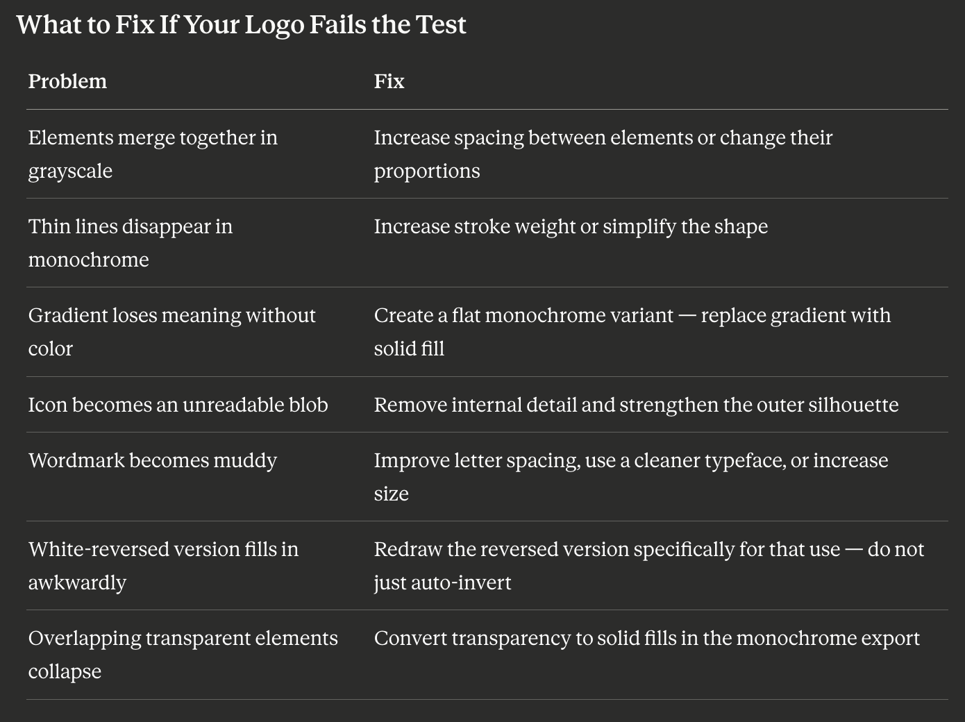
Most of these problems are fixable without a full logo redesign. The SVG source file is the starting point — a designer or a capable editor can produce a strong monochrome variant from the vector source without restarting from scratch.
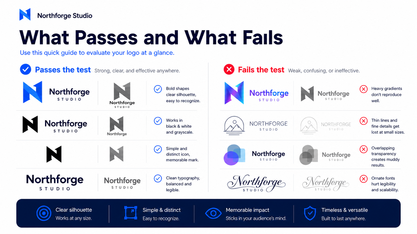
What Passes and What Fails
Marks that typically pass:
- Bold, geometric icon marks with clean closed shapes
- Wordmarks with good letter spacing and clearly legible fonts
- Logos with high contrast between elements at different visual weights
- Marks with strong outer silhouettes that read at small sizes in one color
Marks that typically fail:
- Logos where color differentiation is the only thing separating two elements
- Gradient-heavy marks where the gradient was doing structural work (creating depth or separating shapes)
- Thin-line illustration logos where the linework disappears in single-color reproduction
- Logos with multiple overlapping transparent elements that only read in full color
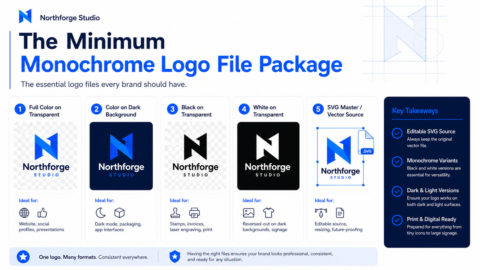
The Minimum Monochrome Logo File Package
A professionally complete logo package includes monochrome variants alongside color versions:
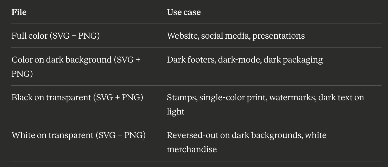
If your current logo package does not include black and white variants in SVG, it is not complete. These are not optional extras — they are the files you will need when real-world production demands arise.
A Note on Color and Perception
Color influences how a brand is perceived. Blue is often associated with stability or trust in Western business contexts. Green is frequently used to signal health, nature, or growth. Red can suggest energy or urgency. Black often supports premium or authoritative positioning.
These associations are real, but they are context-dependent. The same color can carry different meanings across cultures, industries, and saturation levels. Color strategy is worth thinking about — but it is a layer applied to a strong mark, not a substitute for one.
Build the mark so it works without color. Then choose color carefully. That sequence produces logos with both structural strength and emotional resonance.
FAQ
Does every logo need to work in black and white?
Yes — for any logo intended for professional use. Embroidery, print, stamps, dark-mode interfaces, and monochrome documents are standard production contexts, not edge cases.
Can a gradient logo work in black and white?
A gradient can be converted to a flat monochrome equivalent — the gradient is replaced with a solid fill or simple tonal shift. This monochrome version is a separate approved variant. It is not the same as auto-converting the gradient file, which often produces muddy, structurally weak results.
What if my logo uses color as a primary brand signal?
Color can be the defining feature of a brand — some brands are inseparably associated with a specific color. But even then, the mark itself (the wordmark or icon) must remain coherent without color. The color becomes the brand signal; the mark provides the structural foundation that makes the color meaningful.
My logo uses two colors — is that a problem?
Only if those two colors are the only thing distinguishing elements that would otherwise be identical. If removing the color distinction makes separate elements merge into one unreadable shape, the contrast is dependent on color rather than form. Fix it with spacing, size difference, or position rather than color alone.
Should I hire someone to create my monochrome variants?
If you have the SVG source file, a designer can produce clean monochrome variants relatively quickly — it is not a full redesign. If you only have a PNG, the PNG will need to be vectorized before clean monochrome variants can be created properly.
Create a Logo That Works With or Without Color
Lumance generates editable SVG logos with color, dark, and light variants — so you can test your mark in full color, black-only, and reversed white before using it publicly. A strong logo should still feel recognizable when color is removed.