Simple vs. Complex Logos: Which Works Better for Your Brand?
Simple logos are usually more memorable, scalable, and versatile — but detailed logos can work for craft, heritage, and packaging brands. Learn how to choose the right logo complexity.
Updated: May 2026 · 10 min read
Meta description: Simple logos are usually more memorable, scalable, and versatile — but detailed logos can work for craft, heritage, and packaging brands. Learn how to choose the right logo complexity.
Quick Answer
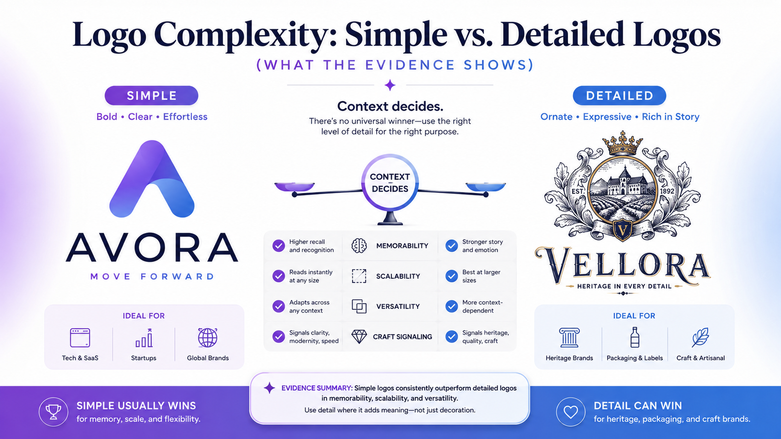
Simple logos usually have an advantage in memorability, scalability, longevity, and versatility. But detailed logos can outperform simple marks when detail communicates something meaningful about the brand — especially in craft, heritage, luxury, or packaging-led categories. The right choice depends on where the logo will primarily be used, not on a universal rule.
Are Simple Logos Better Than Complex Logos?
Simple logos are usually better for digital-first brands because they are easier to remember, scale, reproduce, and use across formats. Complex logos can work when detail supports the brand's category — such as craft, heritage, luxury, or packaging-led products — but they typically need simplified companion marks for small-size use. The answer depends on context, not convention.
When Should a Logo Be Simple or Detailed?
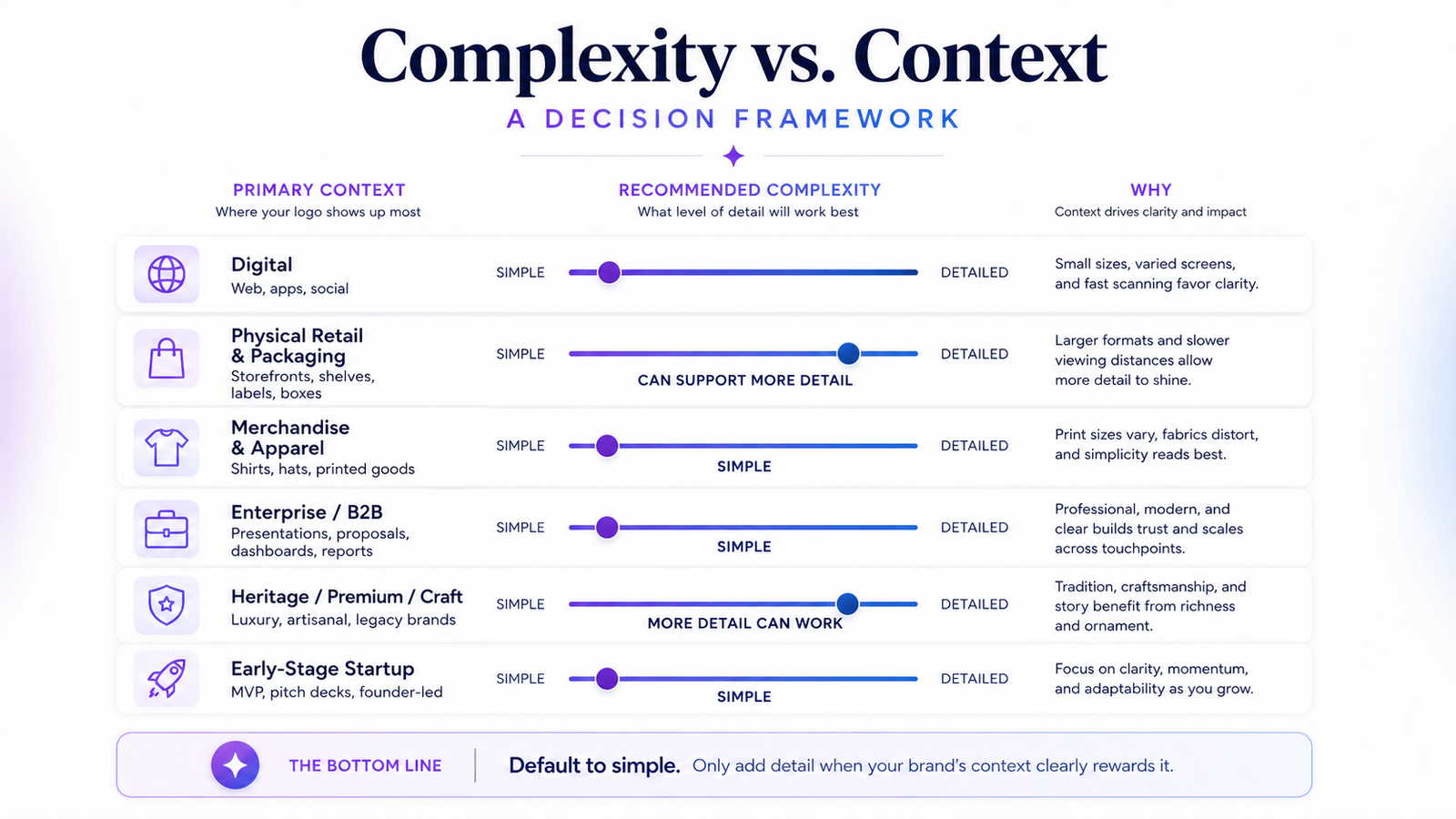
Use a simple logo when the brand needs to work across websites, apps, social profiles, favicons, signage, merchandise, and documents. Use a more detailed logo when the primary brand experience is packaging, craft, heritage, or large-format display. If you choose a detailed logo, create simplified variants for small-size and single-color use.
Defining Simple and Complex
Before comparing the two, it helps to be precise:
Simple logos use a small number of elements — one icon or letterform, one or two typefaces, one to three colors. The mark can be reproduced from memory. It reads clearly at very small sizes. It works in a single color.
Complex logos use multiple elements — detailed illustrations, intricate linework, multiple colors, decorative frames, layered imagery. The mark requires close attention to appreciate its full detail and often loses legibility at small sizes or in single-color reproduction.
Neither is inherently wrong. They serve different purposes and come with different constraints.
What Research Actually Suggests
The evidence on logo complexity is more nuanced than "simple always wins."
A widely cited 2019 study published in the Journal of Marketing Research (Luffarelli, Mukesh & Mahmood) examined 597 brands' logos and found that descriptive logos — logos that visually communicate something about the product or service — can positively influence brand evaluations, purchase intentions, and brand performance. Importantly, these effects were strongest for unfamiliar brands. For brands already known to their audience, the advantage of descriptiveness was significantly reduced.
A separate 2025 study published in the Journal of Business Research found that simple logos tend to increase consumers' perceived brand competence, while more complex logos can increase perceptions of warmth. That trade-off is meaningful: a fintech brand may benefit from a simple mark (competence signal); a community café may benefit from something warmer and more hand-crafted.
The practical conclusion: Default to simple, but not empty. A logo should be simple enough to remember and scale, while still carrying enough meaning to feel specific to the brand. For unfamiliar brands — which describes most early-stage businesses — some visual descriptiveness can help customers understand what you do before they know who you are.
As ManyPixels' 2026 logo design trends report puts it: "In 2026, logos will be designed with motion rules and contextual systems from the start — marks that hinge on a single, distinctive micro-decision rather than relying on complexity."
The Case for Simple Logos
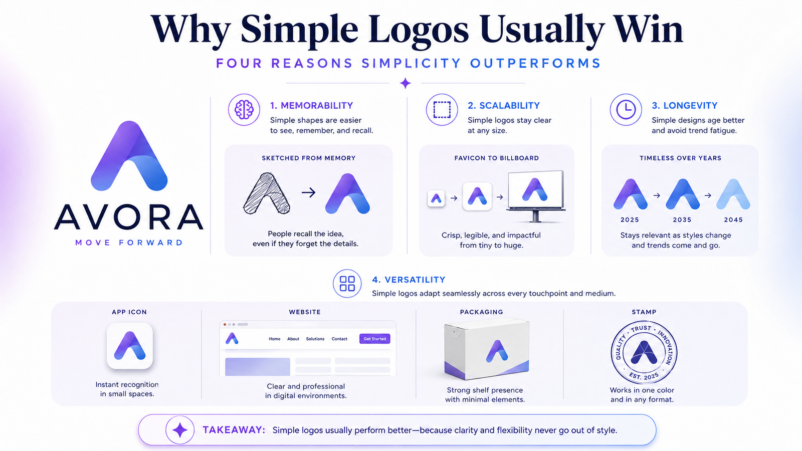
Memory
The brain stores simple visual forms more efficiently than complex ones. A single bold shape is encoded as a compact mental unit. An intricate illustration with multiple interlocking elements requires significantly more cognitive work to encode and retrieve.
This is why the logos most people can sketch from memory are almost uniformly simple — not because those brands lacked budget for complexity, but because simplicity wins the recall race. No Boring Design's logo best practices guide frames it well: "Minimalism 2.0 — a more sophisticated approach that maintains simplicity while incorporating subtle complexity — now defines the most scalable modern brand marks."
Scalability
A simple mark — bold lines, clear shapes, limited elements — maintains legibility from favicon to billboard. A complex mark with fine detail loses legibility rapidly as it shrinks. This is not aesthetic preference; it is a practical constraint of how logos are actually used.
Longevity
Design trends change. Logos built around a specific trend-era aesthetic read as dated when that trend passes. Simple marks based on geometric forms and clean typography tend to age better because they rely on fundamental principles rather than momentary style.
Versatility
Simple logos work in more contexts without modification: embroidery, watermarks, single-color stamps, gold foil print, favicons, neon signs, large-format banners. Complex logos often require context-specific modifications — simplified embroidery variants, higher minimum size requirements, single-color versions that barely resemble the original.
The Case for Detailed Logos
This is not a one-sided argument. Detailed logos have genuine advantages in specific contexts — and it is important to give them a fair assessment.
Craft and category signaling
In categories where craftsmanship, heritage, and premium positioning are core to the brand value, visual detail can communicate those qualities directly.
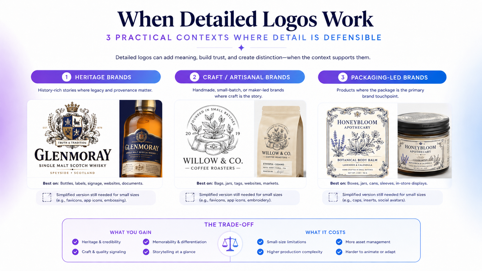
A boutique coffee roaster focused on single-origin sourcing may benefit from a more detailed illustrated mark — particularly when the packaging is the primary brand touchpoint and the detail signals handcrafted care. A whisky brand may use a crest or seal because heritage and provenance are literally part of the product story. A tattoo studio or artisan bakery may use hand-drawn details because the identity itself needs to communicate human skill.
In these cases, the complexity is not decorative. It is communicating something the brand needs to say and cannot say more simply.
Large-format applications
Detailed logos are designed to be experienced at large sizes — on packaging, editorial layouts, or signage where people spend time with the mark. At these sizes, detail rewards attention rather than overwhelming it.
The problem arises when the same mark is forced to work at favicon and app icon size. This is why the hybrid system exists.
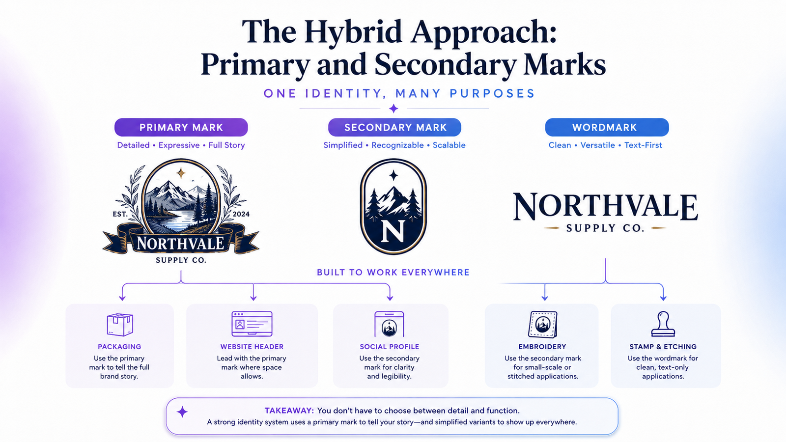
The trade-off: Detailed marks still need simplified companion versions for small-size and single-color contexts. Choosing a detailed primary logo means committing to building a logo system, not just a single mark.
Simple Does Not Mean Generic
The most important nuance in this debate: simplicity and distinctiveness are separate qualities. A mark can be simple without being ownable.
A plain circle, an abstract triangle, or a generic lettermark may be simple — but it is not distinctive enough to build brand recognition. Dozens of businesses in any industry use nearly identical abstract geometric marks.
A strong simple logo still needs one specific idea: an unusual proportion, a distinctive cut into a letterform, a custom junction between letters, a meaningful negative space detail, or a color relationship that belongs to this brand specifically.
The goal is not to remove meaning. The goal is to remove everything that competes with the meaning. Simplicity without specificity produces logos that are easy to forget, not easy to remember.
Logo Complexity Decision Scorecard
Score each factor from 0–2 based on your brand's situation:
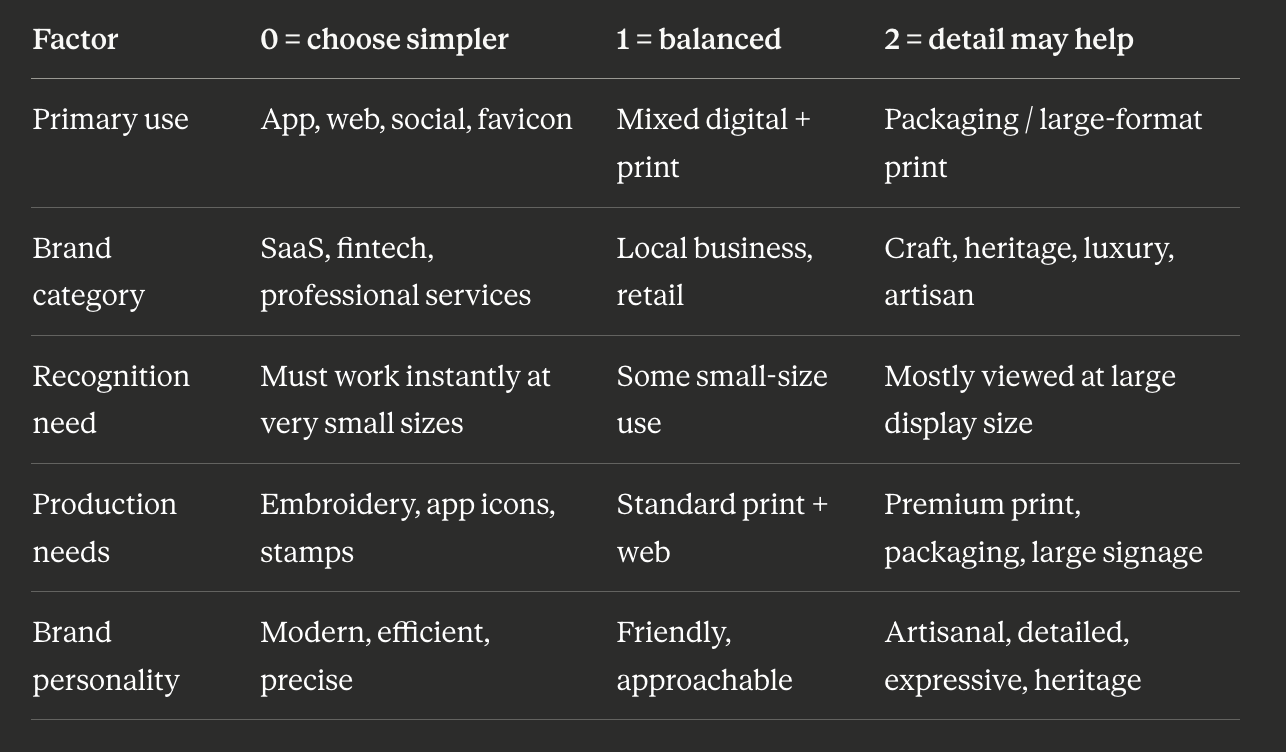
0–4: Keep the logo simple — digital-first scalability is the priority
5–7: Use a simple main logo with one distinctive detail or unexpected element
8–10: A more detailed primary mark can work — but plan for simplified secondary variants
The Hybrid Approach: Primary and Secondary Marks
Many brands with detailed primary marks solve the scalability problem with a mark system:
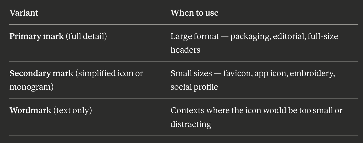
This system allows the brand to maintain the equity of a detailed primary mark while remaining functional across all practical contexts. It requires more design work upfront — but provides the flexibility that complex marks need to survive real-world use.
How AI Logo Tools Handle Complexity
AI logo generators are strongest when the brief asks for clarity: a distinct shape, a clean wordmark, a limited palette, and a use case such as "must work as an app icon and favicon." They are less effective when asked to produce highly detailed illustrative logos requiring hand refinement, precise linework, or multi-variant production.
That does not make AI logo tools worse — it means they are best matched to the needs of digital-first businesses, where scalability and speed matter more than ornamental detail.
For brands that need a detailed primary mark (craft, packaging, heritage), AI tools can generate a useful starting direction or companion simplified mark, while the primary detailed illustration may need a human designer's hand for the final execution.
For most early-stage digital businesses, AI logo tools' default toward clean, scalable marks aligns perfectly with what the brand actually needs.
FAQ
Do expensive logos tend to be more complex?
Not necessarily. Many of the most expensive logo redesigns in history have simplified the mark significantly. Airbnb's "Bélo" mark was reportedly the result of a seven-figure branding project — and it is a deliberately simple, abstract shape. Investment buys craft attention and strategic rigor, not necessarily visual complexity.
Is a wordmark (text-only logo) considered simple or complex?
A well-designed wordmark sits on the simpler end of the complexity spectrum — its sophistication comes from typographic nuance rather than illustrative detail. Wordmarks scale well, age well, and are inherently distinctive when the brand name is short and visually interesting. They are also the hardest to "copy" with a template, since the letterforms themselves carry the identity.
Can a simple logo look premium?
Yes. Many of the world's most premium brands use extremely simple marks. The association between complexity and premium is not supported by the evidence — premium perception comes from restraint, quality of execution, and consistent brand presentation, not from the number of elements in the mark.
When should a startup use a detailed logo?
When: the brand's primary value is directly connected to craft, heritage, or premium positioning; the primary brand touchpoint is packaging or large-format print; and the founding team has accepted the trade-offs — multiple simplified variants needed, limitations on small-size use, and potentially shorter shelf life before a refresh is needed.
Choose the Right Level of Detail for Your Brand
Lumance generates logos from a specific prompt, so you can guide the output toward a minimal mark, a bold icon, a clean wordmark, or a more distinctive direction. Start with context: where will your logo appear most — app icon, website header, packaging, social profile, or merchandise? Then generate a mark that fits that use case and export it as SVG.