Logo Scalability Test: How to Check If Your Logo Works at Any Size
A scalable logo stays clear, recognizable, and usable at every size — from a 16×16px browser favicon to large-format signage.
Updated: May 2026 · 9 min read
Meta description: Learn how to test whether your logo is scalable across favicons, social profiles, websites, print, embroidery, and signage — plus why SVG matters and when you need a simplified logo version.
Quick Answer
A scalable logo stays clear, recognizable, and usable at every size — from a 16×16px browser favicon to large-format signage. To test scalability, check your logo at 16px, 32px, 100–150px, 400px, and full display size; convert it to black and white; and confirm the master file is SVG or EPS (a vector format). If it remains legible, identifiable, and crisp across all those contexts, it is scalable.
How Do You Test Logo Scalability?
Test a logo at five sizes: 16×16px, 32×32px, 100–150px wide, 400×400px, and large display size. Then test it in black and white and on light and dark backgrounds. If it remains recognizable, legible, and crisp in each context, it is scalable. If it blurs, becomes illegible, or loses its identity, it needs either simplification or a dedicated small-size companion mark.
Why Scalability Is a Practical Requirement, Not a Design Opinion
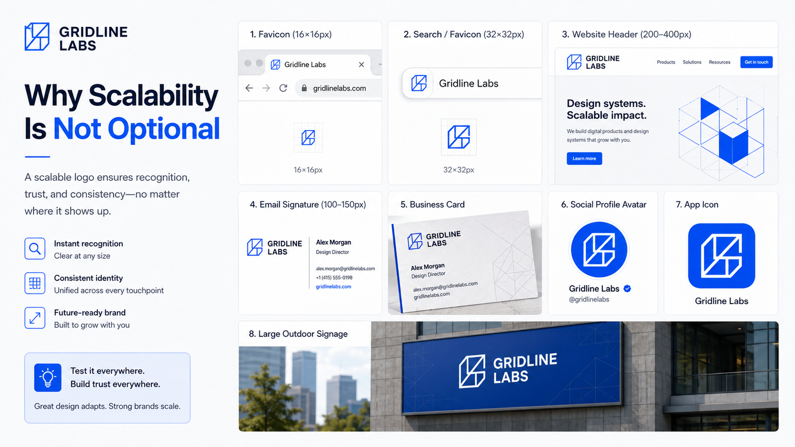
A logo does not live in one place at one size. In normal use, it appears across dozens of contexts simultaneously:
- Browser favicon (16×16px)
- Search result favicon (32×32px)
- Email signature (100–150px wide)
- Website header (200–400px wide)
- Social media profile (400×400px square)
- Business card (approximately 25–35mm wide)
- Branded merchandise (varying)
- Building signage (1–2m or larger)
A logo that works beautifully at 800px and collapses at 32px is failing in several real-world contexts every day. Scalability is not a bonus feature — it is the baseline requirement for a logo to function as a brand asset.
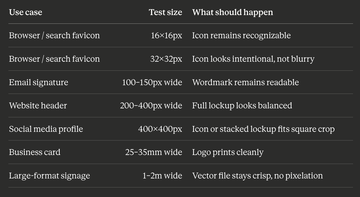
Logo Size Testing Benchmarks
Use these as your standard testing sizes before finalizing any logo:
The Logo Scalability Scorecard
Score your logo on each test using this scale: 0 = fails, 1 = partially works, 2 = passes cleanly.
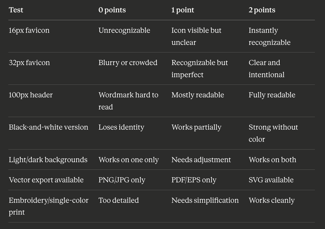
Scoring:
- 11–14: Scalable — ready for professional use across all contexts
- 7–10: Needs refinement — simplify the mark or create a companion small-size version
- Below 7: Not scalable — a logo system with simplified variants is needed
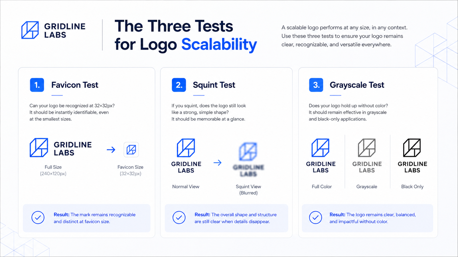
The Three Tests for Logo Scalability
Test 1: The Favicon Test
Resize your logo to 32×32 pixels and view it on screen. This is the size Google displays favicons in browser tabs and search results.
What you're looking for: Is the brand mark still recognizable? Is there a single clear shape that reads at this size? If the wordmark is illegible (which is normal — most text becomes unreadable below 50px), is there a standalone icon that works?
A logo that has no viable icon companion mark will have a broken favicon — the most-seen version of your brand mark on the web.
Test 2: The Squint Test
Display your logo at normal size. Squint until the image blurs. What remains?
A clear, confident shape should persist. If the logo dissolves into visual noise when blurred, there are too many fine details competing for space. The mark lacks the visual mass needed to hold up at small sizes.
Test 3: The Black-and-White Test
Convert your logo to grayscale, then to pure monochrome. Does it remain recognizable and coherent?
Color can compensate for weak structure at screen sizes. Single-color print, embroidery, and stamps reveal what the mark actually looks like without color. If the logo loses all visual interest without color, the underlying structure is too dependent on color to do work that the mark itself should handle.
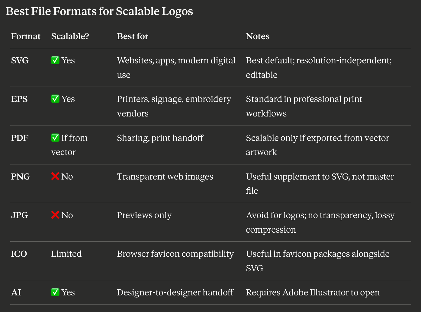
The practical rule: SVG for web, EPS or AI for print and production handoff, PNG for digital contexts where SVG is not accepted. Never use JPG as your master logo file.
If your current logo only exists as a PNG, that is not a complete logo package. The SVG or EPS is the master file from which all other formats should be generated.
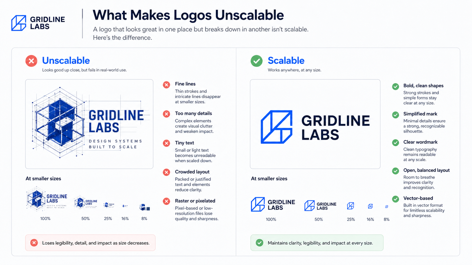
What Makes a Logo Unscalable
Thin strokes and fine detail. Very thin lines can disappear at small sizes or break up in embroidery, engraving, and low-resolution print. Test any thin stroke element at the smallest real use case before approving the logo — the exact threshold varies by output medium, so always confirm at the target size rather than relying on a fixed rule.
Intricate illustrations. Detail that reads as richness at large sizes becomes an indistinct blob at small sizes. The level of detail appropriate for a brand book illustration is not appropriate for a favicon.
Too many elements. Every element in a logo competes for visual attention. At large sizes, multiple elements coexist. At small sizes, they crowd each other into noise.
Text that tries to scale with the icon. A full wordmark at favicon size is illegible — not because the font is bad, but because there is not enough space. Logos that include a wordmark need a standalone icon companion for small-size contexts.
Color-only differentiation. If two elements of your logo are distinguished only by color — the icon is blue, the text is orange, and they merge into an indistinguishable grey in monochrome — the contrast is doing structural work that spacing, weight, or position should be doing.
When You Need a Simplified Logo Version
A professional logo does not always mean one mark that works everywhere. In many cases, a scalable brand identity is a system of related marks, each optimized for a different context.
Use your full logo (icon + wordmark + tagline if present) for:
- Website hero sections and desktop headers
- Presentations and pitch decks
- Brand documents and letterheads
- Large-format signage and banners
- Packaging at a size where the full mark is legible
Use a simplified icon or monogram for:
- Browser favicons (16px, 32px)
- App icons
- Social media profile photos
- Embroidery on merchandise and uniforms
- Small stickers or labels
Creating these variants is not a sign that the logo has failed. It is how professional brand identity systems work. Most major brands — Airbnb, Spotify, Slack — maintain multiple approved logo configurations for different contexts.
Scalability Is Also About Spacing and Proportions
A logo can be technically simple and still fail in practice if its proportions or spacing create friction in common containers.
Test how your logo sits inside:
A square crop: Social profile photos are square on most platforms. Does the logo fit naturally in a 1:1 ratio, or does it get awkwardly cropped?
A horizontal strip: Website headers are typically narrow and wide. Does the horizontal lockup remain balanced in this container?
A circular crop: Some platforms (WhatsApp, certain app icons) display profile images in circles. Does the icon survive a circular crop without important elements being cut?
A narrow email signature: Email signatures are often viewed on mobile at very small widths. Can the logo remain legible at under 150px wide?
If the logo requires custom adjustment for every context, the system is not scalable. A well-designed logo — or a well-designed logo system — should fit cleanly into each standard container without manual intervention.
Designing for a Responsive Logo System
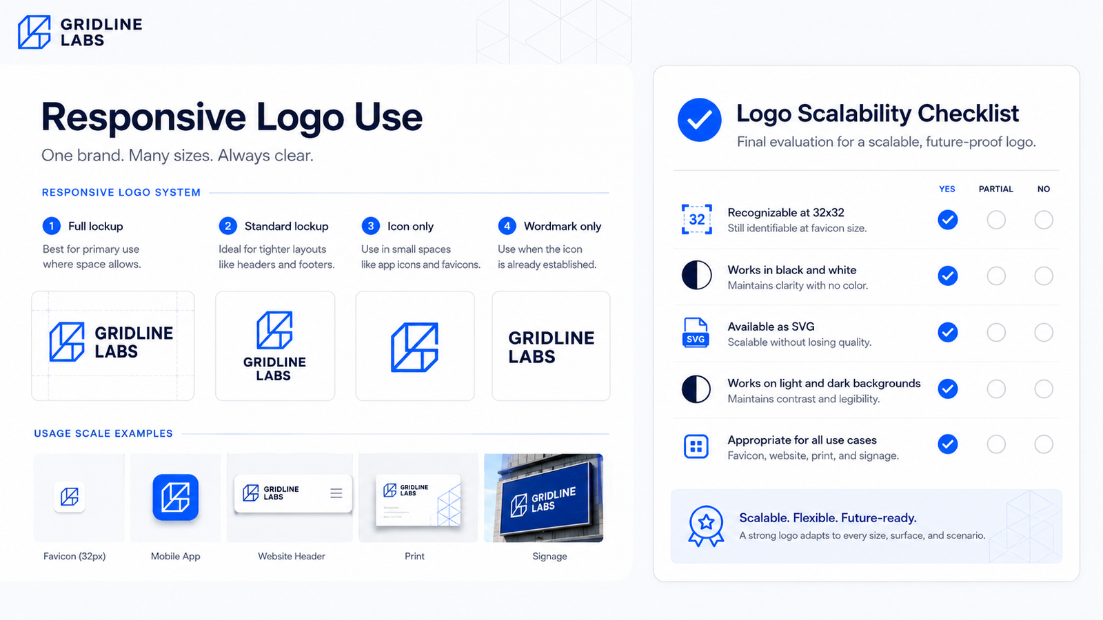
A responsive logo system is the professional answer to scalability. Rather than forcing one mark to work everywhere, the system provides approved variants for each context:
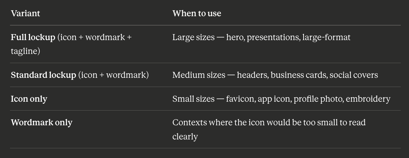
Having all four approved variants means you never have to improvise a logo use — there is always a correct version for the context.
FAQ
What is the minimum size a logo should be readable at?
As a general guide, a wordmark needs at least 80–100px of width on screen to remain legible. At smaller widths, switch to a standalone icon mark. For print, a wordmark typically needs at least 20–25mm to remain readable, though this depends on the typeface and letter spacing.
Can a detailed logo be made scalable?
Yes — but it usually requires a parallel simplified variant for small-size use. A complex primary mark can be the full-size identity, with a reduced icon mark for favicons, app icons, and embroidery. This is a system design decision, not a failure of the primary mark.
Is a high-resolution PNG equivalent to a vector file?
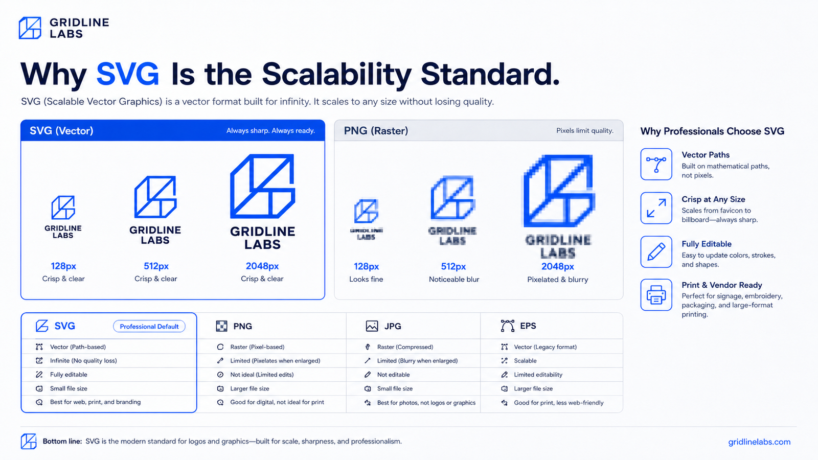
No. A high-resolution PNG is a large fixed grid of pixels — it looks good at its native resolution and degrades when scaled beyond it. A vector file (SVG, EPS) is mathematically defined and renders crisply at any output size. For professional use, vector is the master file and PNG is a generated export for specific digital applications.
Does my website logo need to be SVG?
SVG is the recommended format for web logos because it is resolution-independent (looks sharp on retina and 4K displays), file-size efficient, and can be styled via CSS. Most modern website builders (Framer, Webflow, Squarespace, Shopify) accept SVG directly.
How many logo variants should I have?
At minimum: full-color SVG, black-only SVG, white-only SVG, transparent PNG. Ideally, also a standalone icon version and a favicon-sized ICO or PNG. A complete system also includes dark-background and light-background PNG exports.
Generate a Logo You Can Actually Scale
Lumance generates logos with SVG export included by default, so your final mark is ready to test across favicon, website, social, and print use cases from day one. After generating, use the scorecard above to confirm it works at small sizes, in black and white, and on both light and dark backgrounds.