How to Design a Logo That Scales from Favicon to Billboard
A truly effective logo isn't just visually appealing; it's also incredibly versatile. Discover how to design a logo that looks sharp and recognizable whether it's a tiny favicon or a towering billboar
Your logo is the cornerstone of your brand identity, and its ability to adapt across various platforms and sizes is paramount. Imagine a logo that looks fantastic on a business card but becomes a pixelated mess on a website header, or worse, an unreadable blur on a billboard. This isn't just an aesthetic issue; it's a fundamental branding problem.
Designing a logo that scales effectively – from the smallest favicon (16x16 pixels) to the largest billboard – requires a deep understanding of core design principles. It's about ensuring your brand's visual integrity remains intact, regardless of where it appears. This guide will walk you through the essential considerations and actionable steps to achieve true logo scalability.
Why Scalability Isn't Optional Anymore
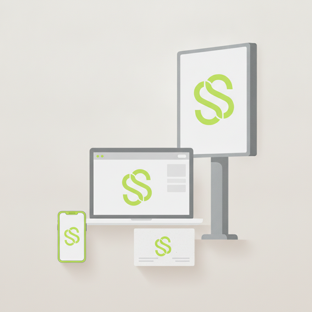
In today's multi-channel world, your logo lives everywhere. Consider the sheer diversity of touchpoints:
- Digital: Favicons, social media profiles, app icons, website headers, email signatures, digital ads, video intros.
- Print: Business cards, letterheads, brochures, merchandise (t-shirts, mugs), vehicle wraps, signage, storefronts, billboards.
Each of these contexts presents unique challenges related to size, resolution, color reproduction, and background. A logo designed without scalability in mind will inevitably fail in some of these scenarios, leading to a fragmented and unprofessional brand image. A scalable logo, by contrast, is a workhorse, consistently delivering your brand's message with clarity and impact.
Core Principles for Scalable Logo Design
1. Simplicity is Key
The most successful and scalable logos are almost always simple. Think of iconic logos like Nike's swoosh, Apple's apple, or the FedEx arrow. They are immediately recognizable, even when seen at a glance or in miniature. Complex details, intricate patterns, or subtle gradients often disappear or become muddy at smaller sizes.
- Actionable Tip: Start with the absolute core idea of your brand. Can you represent it with the fewest possible lines, shapes, and colors? Remove any element that doesn't contribute significantly to the logo's message or recognition.
2. Embrace Vector Graphics
This is perhaps the most crucial technical aspect of scalability. Vector graphics (like those created in Adobe Illustrator, Affinity Designer, or generated by Lumance's AI logo maker) are resolution-independent. This means they are defined by mathematical equations rather than pixels. You can scale a vector logo to any size – from a tiny icon to a giant billboard – without any loss of quality, pixelation, or blurriness.
- Actionable Tip: Always insist on receiving your final logo files in vector formats (e.g., .SVG, .AI, .EPS, .PDF). Raster formats (e.g., .JPG, .PNG, .GIF) are pixel-based and will pixelate when enlarged beyond their original resolution.
3. Clear and Legible Typography
If your logo includes text (a logotype or wordmark), the chosen font must be legible at all sizes. Script fonts, ultra-thin fonts, or highly decorative typefaces often lose their readability when scaled down.
- Actionable Tip: Choose a font that is clear, distinct, and has good spacing (kerning and tracking). Test your chosen typeface by shrinking it down significantly. Does it still convey the words clearly? Consider using a custom logotype that's been specifically optimized for readability at various scales.
4. Smart Color Considerations
While color adds personality, a truly scalable logo should also work effectively in monochrome (black and white). This is essential for applications like faxes, single-color print jobs, or certain branded merchandise.
- Actionable Tip: Design your logo in black and white first. If it looks strong and recognizable without color, it will be even stronger with color. Also, consider color contrast for accessibility and ensure your brand colors translate well across different color profiles (CMYK for print, RGB for screen).
5. Versatile Layouts and Variations
Sometimes, a single logo lockup isn't enough. A scalable brand often requires a system of logo variations:
- Primary Logo: The full version, usually horizontal with logomark and logotype.
- Secondary Logo: A vertical stack or an alternative arrangement for specific layouts.
- Icon/Mark Only: A standalone symbol for small spaces (favicons, app icons).
- Wordmark Only: Just the text for situations where the symbol might be redundant or too small.
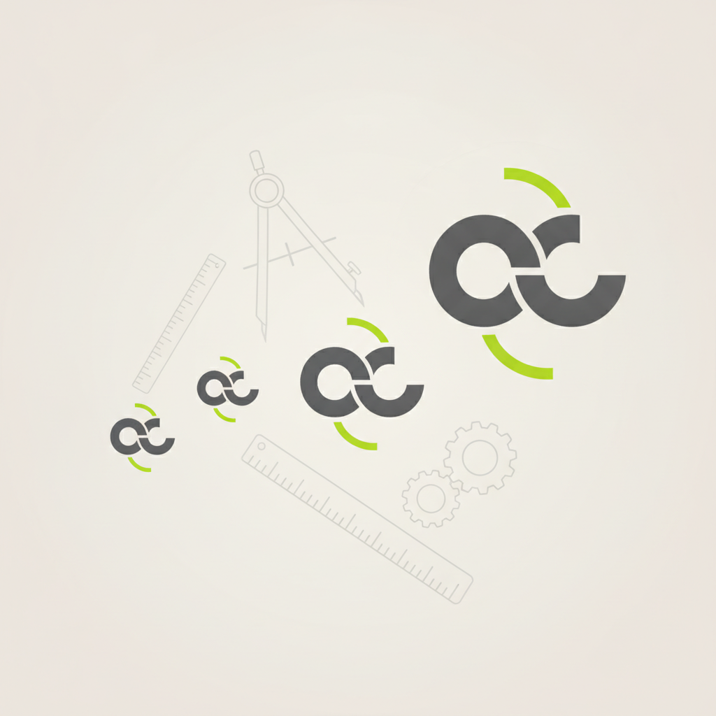
- Actionable Tip: During the design process, intentionally create these variations. Think about how your logo would look if you had to remove the text, or if it had to fit into a perfect square.
Testing Your Logo's Scalability
Don't wait until launch day to discover your logo's limitations. Proactive testing is crucial.
1. The "Squint Test"
Print your logo on a sheet of paper and place it across the room. Squint your eyes. Can you still recognize it? Does it still make sense? This helps you identify if the core message and shape are strong enough to cut through clutter and distance.
2. Digital Mockups
- Favicon: Shrink your logo to 16x16 pixels. Does it retain any recognizable element? Many brands opt for just their initial or a simplified version of their mark for favicons.
- Social Media Profile: Test at common sizes like 180x180 pixels (Facebook) or 400x400 pixels (LinkedIn).
- Website Header: Place it in a typical website navigation bar. Is it clear and proportionate?
3. Print Mockups
- Business Card: Print it at business card size. Is all text readable?
- T-Shirt/Merchandise: Imagine it on a garment. Does it look good?
- Billboard: While you won't print a literal billboard, you can mock it up digitally. Enlarge your vector file significantly. Does it still look crisp? Are there any hidden flaws that become apparent at massive sizes?
Common Pitfalls to Avoid
- Over-reliance on Raster Images: Never design your primary logo in a pixel-based program (like Photoshop) if you intend it to scale. Always start with vector software.
- Too Many Details: Intricate illustrations, busy patterns, or fine lines will vanish or create visual noise at smaller scales.
- Complex Gradients or Shadows: While attractive, these can flatten or become indistinguishable when shrunk, or pose challenges in single-color applications.
- Too Many Fonts: Stick to one or, at most, two complementary fonts for your logo. More than that creates visual clutter and reduces readability.
- Ignoring Negative Space: The empty space around and within your logo is as important as the filled space. Well-utilized negative space enhances clarity and impact, especially at different scales.
Leveraging AI for Scalable Designs
Designing a truly scalable logo from scratch can be a complex process, requiring an understanding of design principles, software, and testing. This is where modern tools, particularly AI-powered logo makers, can be incredibly helpful.
Platforms like Lumance are designed to generate logos that inherently consider scalability. They often produce designs that are:
- Vector-based: Ensuring your logo can be scaled infinitely without pixelation.
- Simplified: AI often favors cleaner, more geometric shapes that translate well across sizes.
- Versatile: Many AI tools offer variations and options for different layouts and icon-only versions, helping you build a comprehensive logo system.
While AI provides a strong foundation, remember to still apply the testing principles discussed above. Use the AI-generated designs as a starting point, then refine and test them to ensure they meet all your scalability requirements.
Designing a logo that scales from favicon to billboard is not just a technical challenge; it's a strategic investment in your brand's future. By prioritizing simplicity, utilizing vector graphics, selecting legible typography, and rigorously testing your designs, you ensure your brand maintains a consistent, professional, and impactful presence everywhere it appears. Embrace these principles, and your logo will serve your business effectively for years to come.
Ready to create a logo that looks perfect at any size? Try Lumance's AI logo maker and build a scalable brand identity today.