The Art of Typography: Choosing and Pairing Fonts for Your Logo
Choosing the right fonts for your logo is crucial for brand identity. This guide explores top font categories, key selection principles, and effective pairing strategies to help your small business cr
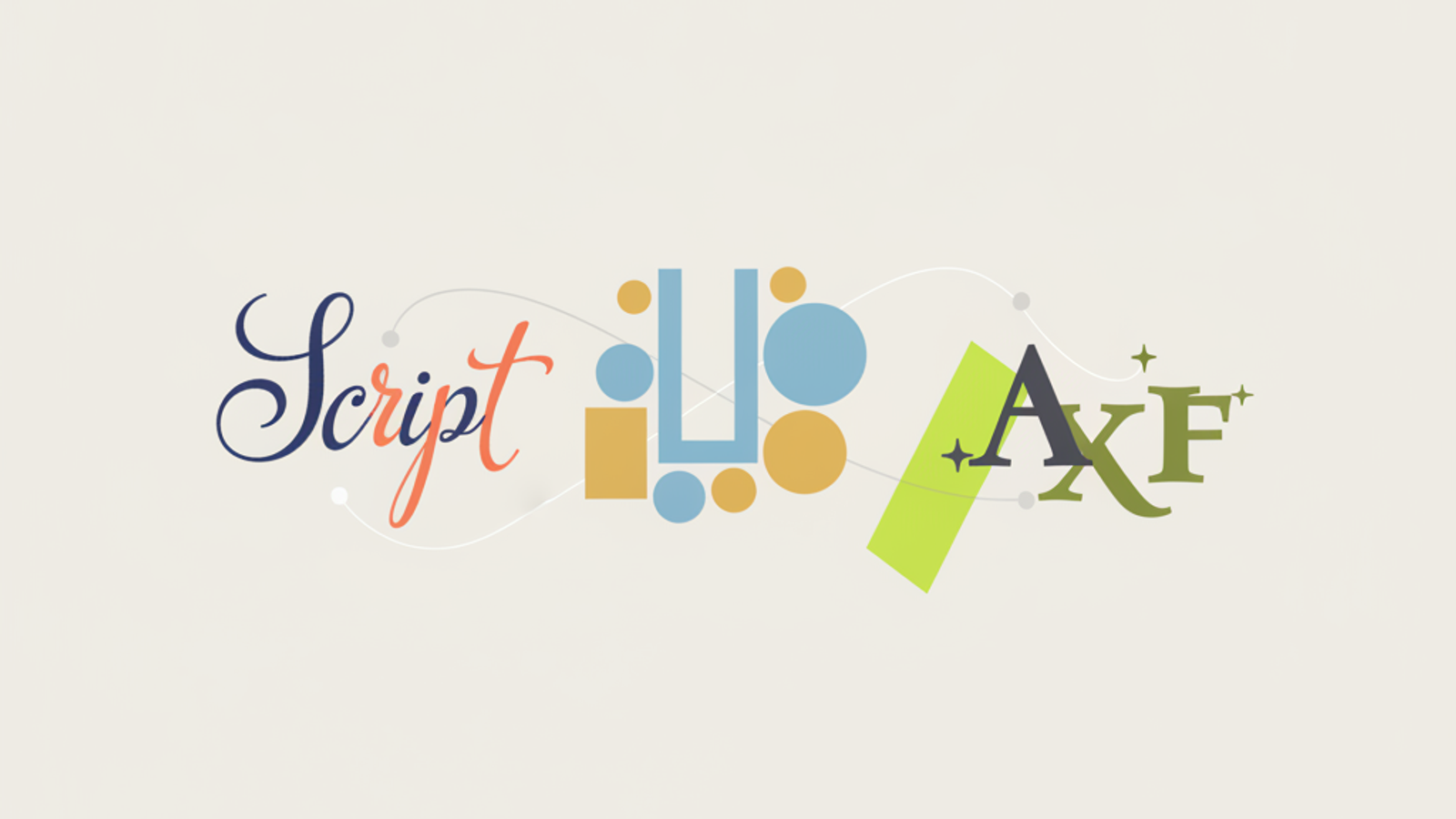
Selecting the right fonts for your logo isn't just a design decision; it's a foundational branding choice that communicates your business's personality, values, and professionalism. A well-chosen font can make your logo memorable, legible, and timeless, while a poor choice can confuse your audience or quickly date your brand. For small business owners and founders, understanding the nuances of typography is key to crafting a logo that truly resonates.
Understanding Font Categories
Before diving into specific recommendations, it's essential to grasp the main font categories and the feelings they typically evoke. Each category has its own strengths and common associations, which can guide your initial selection.
- Serif Fonts: These are characterized by small decorative lines (serifs) attached to the end of a stroke. Think of classic newspaper headlines or book text. Serifs often convey tradition, reliability, elegance, and authority. They can feel established and trustworthy.
- Sans-Serif Fonts: Lacking serifs, these fonts have clean, straight edges. They are generally perceived as modern, minimalist, clean, and highly legible, especially on digital screens. Sans-serifs are popular for tech companies, startups, and brands aiming for a contemporary look.
- Script Fonts: Mimicking handwritten calligraphy, script fonts range from formal and elegant to casual and playful. They evoke a sense of personal touch, artistry, luxury, or authenticity. Due to their decorative nature, legibility can be an issue if not used carefully.
- Display Fonts: These are highly stylized, attention-grabbing fonts designed for specific uses, like headlines or short bursts of text. They often have unique characteristics that make them stand out but are rarely suitable for extensive copy. Display fonts are excellent for injecting a strong personality or specific theme into a logo.
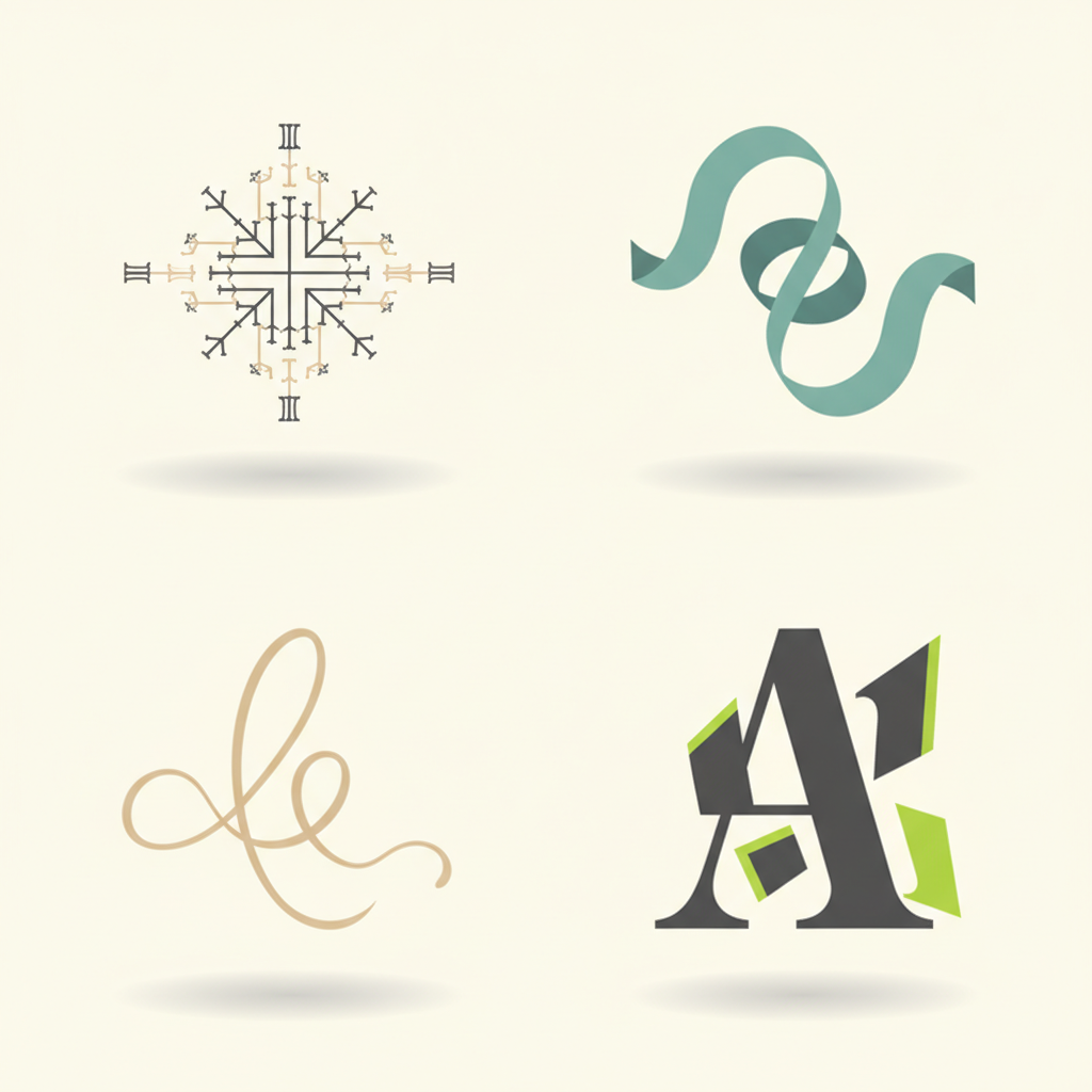
Key Principles for Choosing a Logo Font
No matter the category, certain principles should guide your font selection to ensure your logo is effective and enduring.
1. Legibility
This is paramount. Your logo font must be easily readable at all sizes and across all mediums – from a tiny favicon to a large billboard. Highly decorative or thin fonts can lose legibility when scaled down.
2. Memorability
While legibility is key, your font also needs a distinct character that helps it stand out and be remembered. It shouldn't be so generic that it blends into the background, nor so unique that it's unreadable.
3. Versatility
Your logo will appear everywhere: on your website, business cards, social media, merchandise, signage, and more. Choose a font that looks good and maintains its integrity in various contexts and scales. Font families with multiple weights (light, regular, bold) offer excellent versatility.
4. Brand Alignment
Does the font match your brand's personality? A serious law firm would likely avoid a playful script font, just as a children's toy company might steer clear of a stark, ultra-modern sans-serif. Your font should visually reinforce your brand's core message and values.
5. Timelessness
Trends come and go. While it's tempting to pick a popular font, overly trendy choices can quickly make your logo look dated. Aim for fonts with enduring appeal that won't require a rebrand in a few years. Classic choices often stand the test of time.
Top Font Recommendations for Logos
While the