7 Logo Design Mistakes Small Businesses Make — and How to Fix Them
Learn the seven logo mistakes that make small businesses look amateur — and how to fix them with simpler design, SVG files, scalable layouts, and complete logo variants.
Updated: May 2026 · 9 min read
Meta description: Learn the seven logo mistakes that make small businesses look amateur — and how to fix them with simpler design, SVG files, scalable layouts, and complete logo variants.
Quick Answer
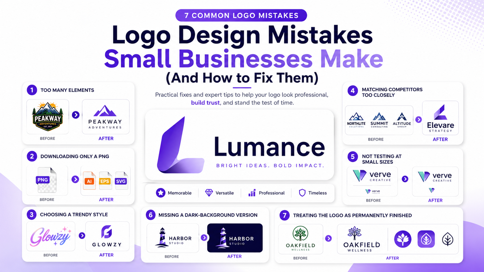
The most common small business logo mistakes are: using too many elements, relying on PNG files instead of SVG, choosing trend-driven styles, copying competitors, failing to test at small sizes, forgetting dark-background variants, and treating the first logo as permanent. Most can be fixed by simplifying the mark, exporting vector files, creating proper logo variants, and testing the logo in real-world contexts.
What Are the Most Common Logo Mistakes Small Businesses Make?
The most common small business logo mistakes are using too many elements, downloading only a PNG instead of SVG, choosing trend-driven styles, copying competitor visual language, not testing at small sizes, missing dark-background variants, and treating the initial logo as a finished forever decision. Most of these mistakes are fixable — often without starting from scratch.
Mistake 1: Too Many Elements
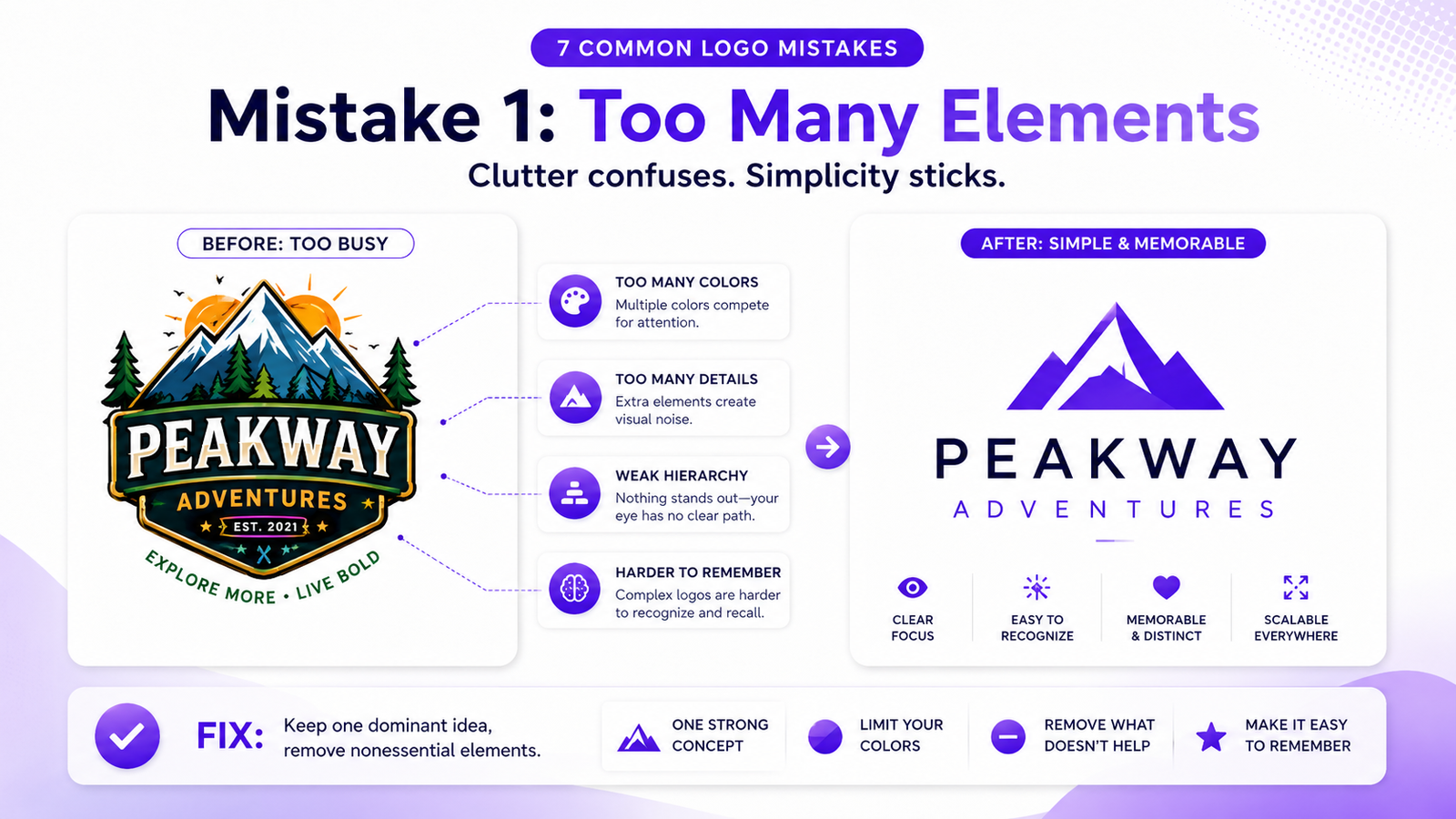
What it looks like: A logo with an icon, a wordmark, a tagline, a decorative badge frame, and four colors — all competing for attention in a small container.
Why it happens: More elements feel like they communicate more. It seems logical that a richer, more detailed mark would say more about the brand.
Why it's wrong: Every element added is another thing the viewer's eye has to process and the memory has to store. A coffee shop logo featuring a cup, coffee bean, steam wisps, a mountain landscape, a circular badge, and a tagline is usually trying to say too much. A simpler mark — one strong cup silhouette, one clean wordmark, one warm color — is easier to recognize on signage, stickers, and takeaway cups, and far more likely to be remembered.
The fix: Identify the single most important visual element. Everything else is a candidate for removal. If you can't decide what to cut, cut the tagline first, then the decorative frame, then the secondary colors.
Mistake 2: Downloading Only a PNG
What it looks like: A founder who designed or generated a logo, downloaded a PNG, and considers the job done.
Why it happens: PNG is the default download format on many logo platforms. It looks fine on screen, and most founders don't encounter the problem until they need print files or hand the logo to a developer.
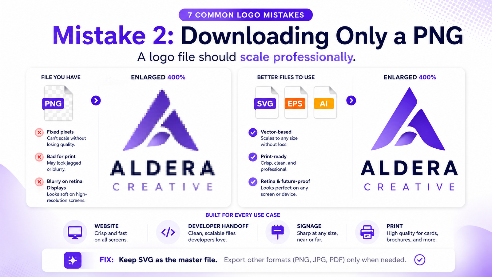
Why it's wrong: A PNG is a fixed grid of pixels. Enlarge it beyond its native resolution and it pixelates. Send it to a printer and they'll ask for a vector file. Put it on a retina display and it renders at half the sharpness it should. Every application that requires scaling — signage, merchandise, large-format print — will expose the limitation.
The fix: Get the SVG. An SVG is a vector file — mathematically defined paths that render crisply at any size. It is the professional standard for logos. If your current logo tool charges extra for SVG, consider tools that include it by default. Always download SVG before considering the logo deliverable complete.
The quick test: Open your logo in a browser. Zoom to 400%. If it pixelates, you have a raster file. Go get the SVG.
Mistake 3: Choosing a Trendy Style
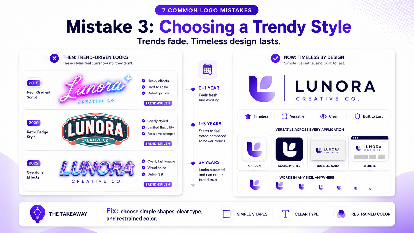
What it looks like: A neon gradient logo in 2021. A maximalist retro badge in 2022. A brutalist flat mark in 2023. Whatever the dominant aesthetic trend was in the year the logo was made.
Why it happens: Trend-driven logos look current when made. They feel validated — "this looks like what successful brands look like right now."
Why it's wrong: Trends date. The neon gradients that felt fresh in 2021 now immediately signal 2021. A logo that reads as "made in a specific year" undermines the brand as time passes. The most durable logos are built around fundamental principles — strong shapes, legible typography, limited color — rather than moment-specific stylistic choices.
The fix: Before committing to any stylistic element, ask: "Will this still feel intentional in 10 years?" If the honest answer is no, it's a trend rather than a design decision. Timeless aesthetics outlast the design cycle they were born in.
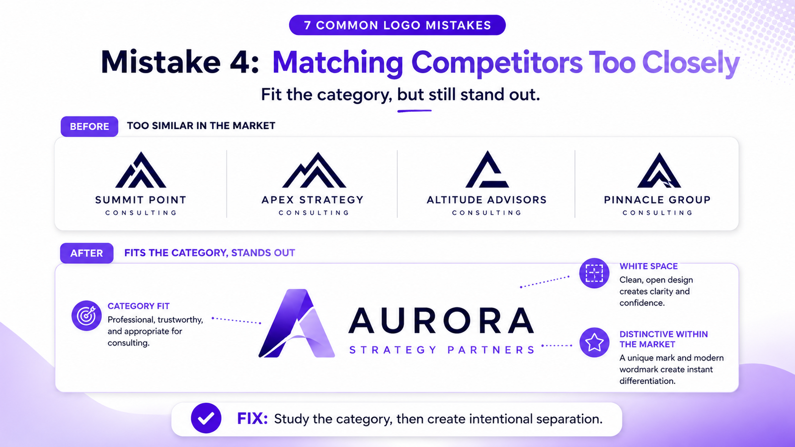
Mistake 4: Matching the Competitor's Visual Language
What it looks like: A fintech startup that goes dark navy because every other fintech is dark navy. A wellness brand that goes green because every other wellness brand is green. A local accounting firm that copies the corporate blue-and-white palette of every national firm it competes with.
Why it happens: Category visual conventions exist for a reason — they signal the right industry immediately. Blue is often used to suggest trust and stability. Green is often used in health and sustainability categories. These associations are useful starting points, but matching them exactly makes a brand invisible within its own category.
Why it's wrong: A local accounting firm doesn't need to look like every other finance brand to feel professional. A cleaner wordmark, a softer blue-gray palette, or a distinctive monogram could still feel trustworthy while being recognizably different from competitors. Blending in signals undifferentiated participation — the opposite of a strong brand.
The fix: Understand the visual conventions of your category, then find the white space within them. If everyone in your category is dark and serious, what does a lighter, more considered version of trust look like? If everyone uses icons, what does a strong wordmark do? The differentiation doesn't have to be radical — it has to be intentional.
Mistake 5: Not Testing at Small Sizes
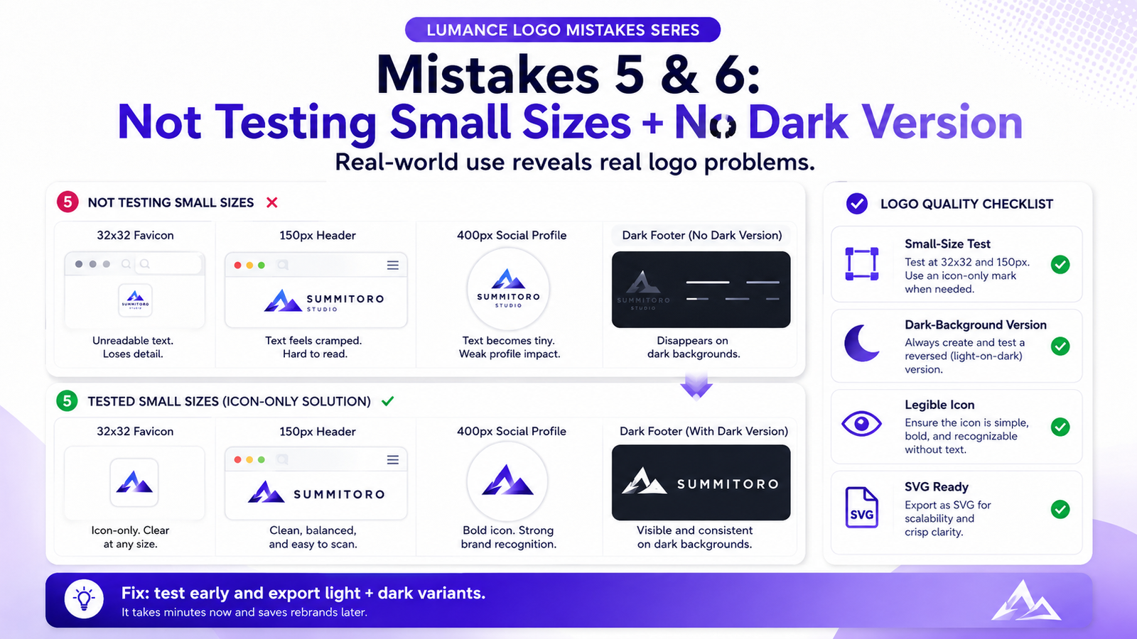
What it looks like: A logo that looks excellent at 800px, becomes illegible at 200px, and is unrecognizable as a browser favicon at 32px.
Why it happens: Logo design — whether in Canva, a template tool, or with an AI generator — is typically done at a comfortable large viewing size. Small-size performance is an afterthought, tested only when the logo is in actual use.
Why it's wrong: Most people encounter logos at small sizes. Favicons, social media profile photos, email signature logos, business card marks — all are small. A logo that only works at large sizes fails at most real-world digital and print touchpoints daily.
The fix: Before finalizing any logo, test at these specific sizes:
- 32×32px (browser favicon and search result favicon)
- 100–150px wide (email signature and mobile header)
- 400×400px (social media profile photo)
If all three work, the logo is scalable. If it blurs or loses detail at small sizes, simplify the icon, increase letter spacing in the wordmark, or create a standalone icon-only companion mark for small-size use.
Mistake 6: No Dark-Background Version
What it looks like: A logo that looks great on a white website header and disappears completely when placed on a dark footer, a black product mockup, or a dark-mode social profile.
Why it happens: Most logo design starts on white. The dark-background application is never considered until someone tries to place the logo somewhere dark and discovers the problem.
Why it's wrong: Dark backgrounds are everywhere: website footers, dark-mode interfaces, black packaging, video intros, keynote slides, and night-mode social profiles. A logo package without a light/white variant for dark backgrounds is incomplete for real-world professional use.
The fix: Create a white (or light) version of your logo — white mark on a transparent background. This should be a standard variant in every logo file package, alongside the full-color and black-only versions. Do not rely on auto-inverting the color logo — test the white version specifically to ensure it holds at the required sizes and proportions.
Mistake 7: Treating the First Logo as a Permanent Decision
What it looks like: A founder who designed a logo at launch, considers it finished, and never revisits it — even as the brand evolves, the audience shifts, or the early mark's weaknesses become apparent.
Why it happens: Logo design feels like a completion event. Done once, done forever.
Why it's wrong: Early-stage brands often launch with a simple starter identity before their positioning, offer, and audience are fully clear. As the business matures, the logo should be reviewed — not changed constantly, but evaluated with fresh eyes as the brand's understanding of itself deepens.
The right mindset: The first logo is a starting point, not a permanent commitment. Schedule a logo review every 12–18 months, not to change for the sake of change, but to ask whether the mark still reflects where the brand is going. A logo that made sense at launch for an MVP may not reflect the brand when it has found product-market fit and is preparing to scale. Consistency matters — but consistency around the right mark matters more.
Mistake 8: Using a Generic Brief (or No Brief at All)
What it looks like: A logo that technically looks polished — clean, professional, appropriate — but could belong to any business in the category. Nothing about it is specific to the brand.
Why it happens: Many founders type a short generic input ("modern coffee shop logo" or "clean tech startup mark") or choose a template from a library. The AI or template does its best with minimal information and produces appropriately generic output.
Why it's wrong: Generic inputs produce generic outputs. A logo becomes distinctive when it reflects specific brand details: the audience, the tone, the product category nuance, the visual direction, and what the brand wants to avoid. "Modern tech startup" describes thousands of companies. "B2B SaaS tool for ops teams, brand feels structured and intelligent, like Linear meets Stripe, dark mode, no literal tech icons" describes one.
The fix: Write a specific logo brief before generating or designing anything. Include: what you do and for whom, three adjectives that describe the brand's personality, a visual direction or aesthetic reference, what colors feel right (and wrong), what to avoid, and whether you prefer an icon, wordmark, or combination mark. The brief investment takes five minutes and meaningfully improves the output.
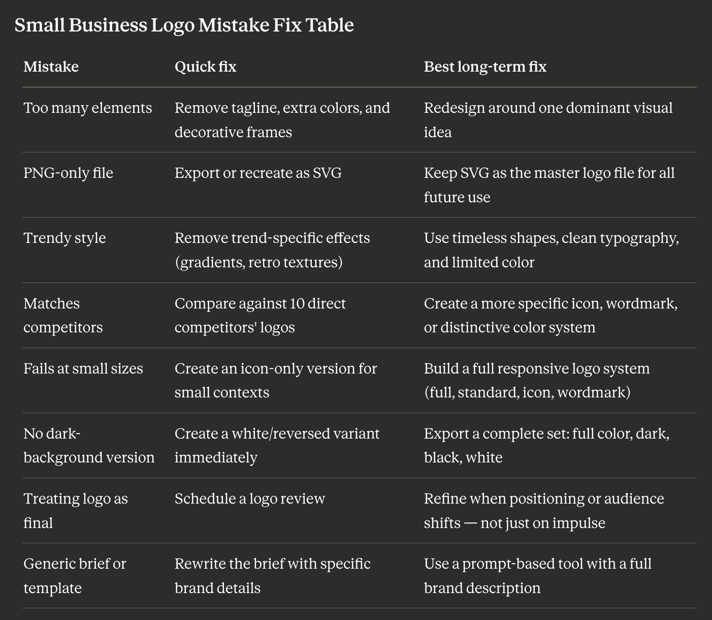
Small Business Logo Mistake Fix Table
Small Business Logo Checklist
Before using your logo publicly, confirm:
- It has one clear visual idea — describable in one sentence
- It uses one or two main colors
- It works at 32×32px (browser favicon)
- It is available as an SVG file
- It works in black and white
- It has a white version for dark backgrounds
- It does not look like the logos of your direct competitors
- It avoids generic category icons (lightbulbs, globes, gears, speech bubbles)
- It can be used on websites, social profiles, print, and merchandise without modification
A logo that passes all nine is production-ready. A logo that fails any of them has a solvable problem.
FAQ
How do I know if my current logo has these problems?
Run these quick checks: (1) Zoom to 32×32px — does it work? (2) Desaturate it — does it hold without color? (3) Place it on a black background — does it disappear? (4) Search Google Images for logos in your industry — does yours look like most of them? Any failure indicates a fixable problem.
Is it expensive to fix a bad logo?
Not always. Many problems — missing SVG, no dark-background version, too many colors — can be addressed without a full redesign. A logo that has the wrong file format simply needs to be re-exported or re-created as SVG. Structural problems (too complex, unscalable) may require regeneration — which is fast and affordable with modern AI logo tools.
Should I start over or fix my existing logo?
Start over if: the mark is structurally weak (too complex, unscalable, genuinely generic). Fix if: the problems are file format, missing variants, or minor simplification. When in doubt, use an AI logo tool to generate alternatives quickly — the comparison often makes the decision clear.
How specific should a logo brief be?
As specific as possible. Five adjectives that describe the brand's personality, a clear statement of what to avoid, a visual reference or two ("like X meets Y"), and a note on color direction is a strong starting point. The more you give, the more distinctive the output.
Create a Logo That Avoids These Mistakes
Lumance helps you generate logos from a specific brand brief — not a generic template. Every logo exports in SVG and comes packaged with the variants small businesses actually need: full color, dark background, light background, black-only, and white-only.